How Long (Has This Been Going On?)
This month, I’m back to being a child of the 70s, and relating some of my musical tastes to what is presently happening in financial markets. This is what happens when one listens to 70s on 7 on Sirius XM Radio. I haven’t been able to get this melody out of my head, so I figured I would write about it.
You probably may not remember the group, as they were mostly a one-hit wonder, a British rock band named Ace, who had moderate success in the 1970s. But singer/songwriter Paul Carrack hit it out of the park with How Long. Here’s the first three stanzas of the lyrics (with my add-ons).
How long has this been going on?
How long has this been going on?
Well, if friends with their fancy persuasion (The Fed)
Don’t admit that it’s part of a scheme
But I can’t help but have my suspicions (I do)
‘Cause I ain’t quite as dumb as I seem
And you said you was never intending (Sure!)
To break up our scene in this way
But there ain’t any use in pretending
It could happen to us any day (And Will)
So, what is IT that has been going on? The unprecedented participation of the Federal Reserve Board in financial markets, which we all thought was enormous back in 2008-09, but was dwarfed by the response in 2020, and it’s still going on, having driven money market rates to essentially zero, buying $120 billion of bonds every month, even with stock markets at all-time highs and housing markets more expensive than ever. Seemingly, the Fed is just printing what appears to be an unlimited amount of money. Aren’t there consequences to that? One would think so, but in all honesty, no one knows WHEN, or WHAT? The latest monthly numbers show inflation running at over 5% year-over-year, which should begin to impact profit margins, and eventually, earnings.
We’ll look at both of those areas this month, along with a piece on Sectors, and how we go about investing cash into the markets. And lest you think I’m stuck in the 70s, please know I constantly switch to the Pulse and The Blend to hear more current music, along with Classic Vinyl and Classic Rewind, to go with the Bridge, Garth Brooks and 80s on 8 on Sirius. And for dance music, you can’t beat The Groove on Channel 50. Yeah, baby, Let It Whip.
Profit Margins And The Impact Of Rising Costs
Harking back to my accounting classes in junior college, let’s first remember that net profit margin is simply the ratio of net income relative to revenues, where you divide net income (or net profit) by sales or revenue. Sales are obviously a huge part of profit margins, along with the cost of goods sold, and fixed expenses. Material costs and direct labor are the two biggest components that have a significant effect on net profit, and those are both coming into play currently in a more correlated way, as the U.S. economy opens up, with much pent-up demand to travel, eat out, and increase consumption. This is being reflected in rising commodity prices, affecting nearly all walks of life. There is pressure on wages, as restaurants and other service industries open fully back up, but many are finding it difficult to hire labor at even $15 per hour.
What’s all this got to do with the stock market, and the performance of your investments? Quite a lot, actually. For some context, in the chart below courtesy of Ned Davis Research, let’s look at how profit margins have fared over time, going back to just before 1950.
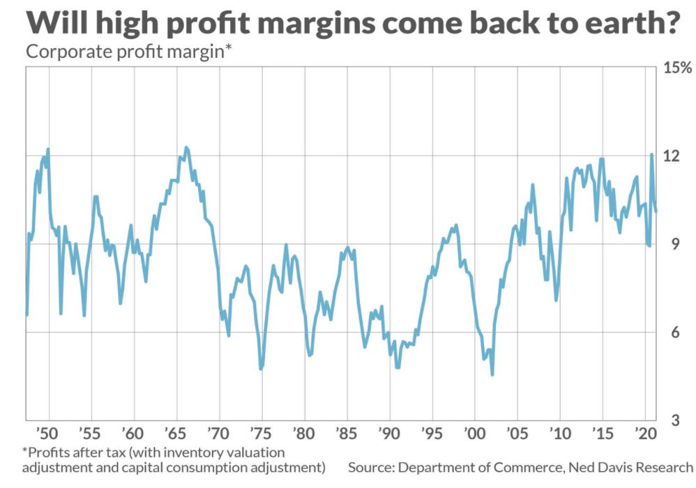
With two exceptions in 1950 and most of the 1960s, profit margins stayed in a range of about 5% to 9% from 1970 to around 2005. In the last 16 years, though, margins have remained elevated north of 9% except for the downturn associated with the Great Financial Crisis of 2008/09. Currently, margins are just over the 10% level. Is it likely they’ll remain elevated in the coming years, supporting stock prices? Anything is possible, as markets and relationships, such as expanding price/earnings ratios, can change over time. But, as you’ll see in the earnings chart below and the weekly price chart of the S&P 500, nothing lasts forever. If margins retreat to the 7% level in the next few years, stock prices will be hard pressed to deliver positive returns. Three factors that could really impact margins are rising wage costs, which already seem to be happening, along with an increase in interest expense and corporate taxes.
An example we can all relate to is legendary brand Campbell Soup Company, which announced last week they are raising prices to compensate for higher transportation, commodity and labor costs. They’re not alone, but are simply the latest example of how inflationary pressures are hindering profits for food manufacturers as well as companies in other industries.
Right or wrong, the Biden Administration has indicated they want to increase the corporate tax rate, which was reduced under President Trump’s administration. Should that happen, with guesses the rate may go from 20% back to around 28%, that will hurt earnings, perhaps to the tune of 5-10%. Then, there’s interest expense. With corporate, treasury and mortgage-backed debt at all-time highs, and growing by the proverbial minute, the direction of interest rates takes on even more importance. Though overall debt has increased substantially in recent years, net interest expense has actually gone down, because of the significant decline in yields. A number of clients have experienced this with their mortgages, refinancing at a lower rate, and in several instances, cutting $500 or more off their monthly payments.
With corporations and the government, though, where issuance of debt is ever-increasing, those savings will go away and then some in an environment of rising interest rates. This is why Fed policy is garnering more attention than ever before. Markets, both stocks and bonds, are addicted to the Fed. We’d be foolish to declare that interest rates are definitively going up. We’ll let the markets tell us. One thing is fairly certain, however. If these three factors increase in coming months/quarters, profit margins will likely decrease, taking stock prices with them.
Earnings Growth Is Like Porridge
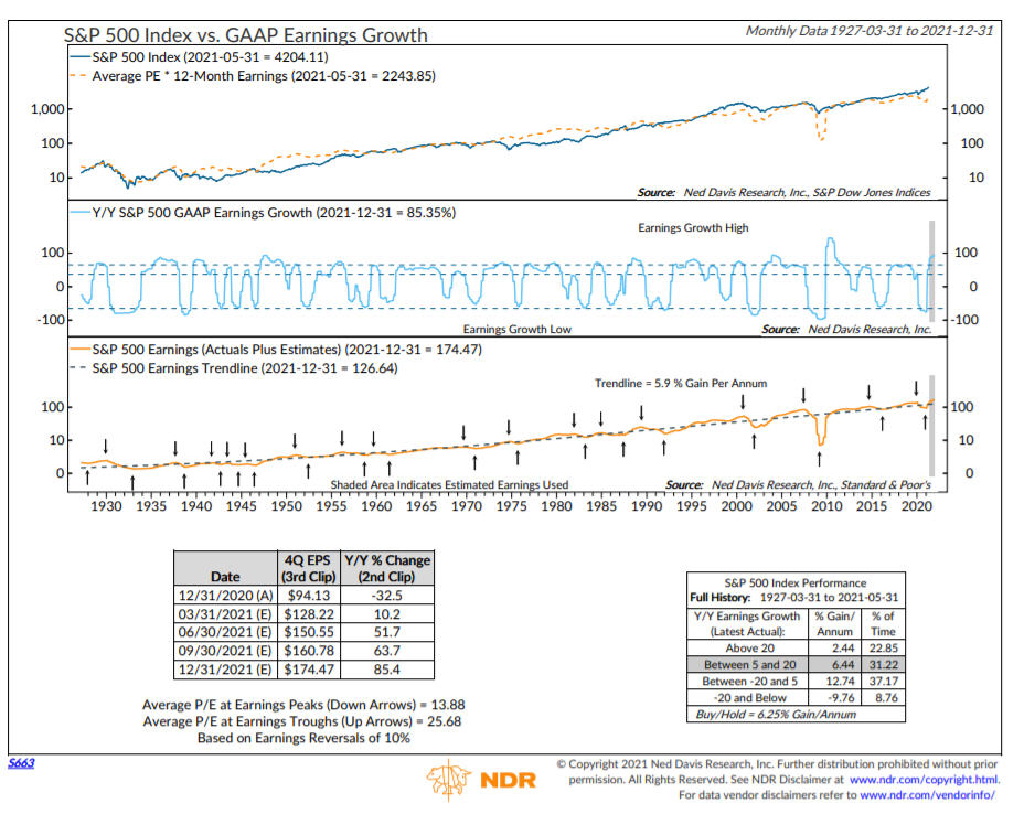
Porridge, you say? Remember the tale of Goldilocks and the Three Bears? She tasted the porridge and said, “This is too hot!” Then she went to the next bowl, and said “This is too cold!” Finally, after tasting the third bowl, she exclaimed, “This is just right.” Yummy. Well, that pretty much explains the rate of earnings growth and the performance of the stock market. Too hot, not so good. Too cold, not so good. In the middle. Ahh. Just right. This may seem illogical, but it describes the relationship between stock prices and earnings, as illustrated in the chart below from Ned Davis Research.
In general, the premise is that the stronger the earnings growth of a company, the better for the stock price. That can be true over the intermediate to long-term, but there are many exceptions. Tesla is an example where traditional earnings and other valuation methods simply don’t work. The stock went public in 2010 at a split-adjusted price of around $5 per share. The company didn’t begin to turn a profit until 2019/2020, yet by January of 2020, the stock price was over $100, and today sits at over $600.
Of course, not all stocks perform that way, and arguably, few perform like Tesla has. Overall, though, it is the tendency of the stock market to reflect what’s going to happen, rather than what’s already happened. Mostly, markets look ahead. That’s why markets start going down before bad news is really apparent, and likewise, much like April of 2020, markets start going up before good news is apparent.
In the chart above, Ned Davis Research took year-over-year earnings growth back to 1927. Using my too hot, too cold analogy above, when earnings growth was really bad (too cold), illustrated by losses of -20% or more, the S&P 500 lost money at an annualized pace of nearly -10%. When earnings growth was between -20% and 5%, this was the sweet spot, with gains of nearly 13% per annum. With growth between 5% and 20%, stocks still have gained over 6% per year. But, when earnings growth has been +20% per year or greater, stocks have struggled, earning less than 2.5% per annum. That’s the too hot analogy. Things are so good, they really can’t get any better. All the good news is already priced into the market.
Which brings us to the current environment. As we enter the second half of 2021, the year-over-year earnings comparisons will likely show a “too hot” condition, above +20%, because the second quarter of 2020 will be removed from the comparisons, and that is when things were pretty bleak, with most of the nation shut down. Coupled with cycles which are suggesting trouble beginning in the July/August period, the next six months may not be nearly as enjoyable for investors as the first six months, despite what may appear to be great news on many fronts.
This Weekly Chart Will Matter. . .At Some Point
As we write this, all six of our stock market risk models are positive. Stock allocations remain 100% invested, and as we’ve mentioned in prior updates, 5 of the 6 have been positive since July 2020, so we’ve never been less than 80% invested for nearly a year. There’s also no change in our high yield bond fund risk model, which remains on its early November BUY signal. We’ve been properly aligned with the uptrends, and our relative strength work has been working quite well, so it’s been a productive time span.
That’s why this is a good time to be reminded that markets will not always be this way. To get rid of the noise that can be present in a daily chart, let’s look at the weekly chart of the S&P 500 Index, courtesy of our friends at Decision Point (www.decisionpoint.com). There are two technical indicator overlays on the chart, the RSI (Relative Strength Index) and the PMO (Price Momentum Oscillator).
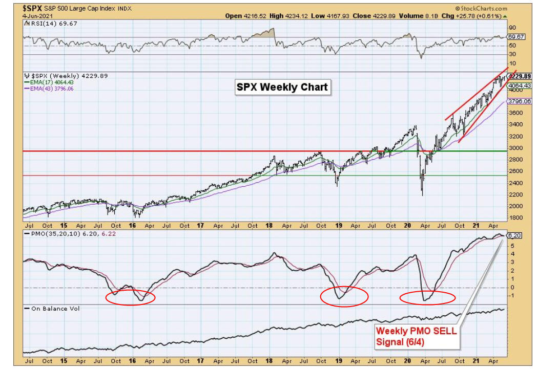
The RSI measures the magnitude of recent price changes to evaluate overbought and oversold conditions, while the PMO is an oscillator based on the rate-of-change of price, and its direction normally indicates if strength is increasing or decreasing. In addition, the steepness of the angle can demonstrate the power of the move. There are a few messages to be aware of when looking at the weekly chart. The uptrend from last March’s low is extremely steep. At some point, that uptrend will break, and the decline could be significant. Second, it is pretty rare for the RSI to be above 70, or below 30. In fact, there have only been two instances in the last six years when the RSI dipped below 30. Those were in late 2018 and last March 2020. Both were excellent buying opportunities, and both were preceded by moves above 70 in the RSI. This is especially relevant, as the RSI moved above 70 earlier this year, and currently sits at 64.
We can’t know when, or how long it will take, but this indicator WILL eventually move below 30 again, and that means there will be price damage. The same is true of the PMO. There have only been three moves below the zero line in six years. There was a gap of nearly three years from late 2015/early 2016 to early 2019 between occurrences, but then another dip 15 months later in March 2020. Currently, the PMO is quite elevated and crossing over its signal line. All you have to do is look at the chart, and the behavior of the indicator, and ask yourself, “Is this a low-risk zone, or a high-risk zone?” There are few guarantees in markets, but I would suggest this isn’t a low-risk zone. As noted above, our portfolios are fully invested, but they have been mostly that way since last July. Stocks are in a different place today than last July.
Sector Relative Strength
The conventional wisdom in our industry is that one should diversify, own a bit of everything, and that selection (what you own) doesn’t work, or can’t add value. I do feel that some of that wisdom is misguided, at best. For instance, in our passive, buy and hold/rebalance portfolio using Vanguard funds, we do own international stocks at all times. The current ratio is 75% domestic and 25% international, and the 75% is almost evenly divided between large, midcap and small company stocks. We cover all the bases. In the long run, this does work. The key is sticking with it, year-in and year-out. But, in our tactical portfolios, which is the vast majority of capital we manage for clients, we use relative strength to allocate our equity allocations. This forces us to own what is doing the best, and ignore the rest. In the long run, this works too, and we think it works better, whether it be with funds, indexes, individual stocks, or sectors.
We’ve seen a number of studies over time, and thought we’d pass along a recent test from our friends at Dorsey Wright. They took the 11 sectors that the S&P 500 tracks, and ranked them by relative strength on a monthly basis, going back to 1999. These sectors include Information Technology, Healthcare, Financials, Consumer Discretionary, Communication Services, Industrials, Consumer Staples, Energy, Utilities, Real Estate and Materials.
In the period shown, from December 1999 to April 2021, the S&P 500 compounded at 5.02% (without dividends). If one owned all 11 sectors, equally weighted, you would have earned 5.86% per annum. Look at the spread between owning the worst 2 sectors each month, versus owning the best two. The difference is a striking 4.10% compared to 7.45%.
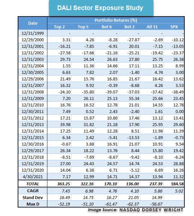
In this process, there is no timing. One is still fully invested at all times. You’re just changing what you own. What would you rather do? Own the S&P 500 and earn 5% per year, or own the best sectors, and earn 7.4% per year, which is nearly a 50% improvement? A good friend of mine in our business hails from the Atlanta area. He would look at this and say something like “Hey, I’m just a good ‘ol boy from Georgia, but it sure seems to me there’s something in that math to pay attention to.” Which is why we do. Granted, nothing works all of the time, and relative strength is no different. But we feel this type of process will continue to add value over time, whether it be with funds, ETFs, sectors or individual stocks.
Allocating Cash To Investments
Throughout the course of time, clients are sometimes withdrawing capital from their accounts for certain needs (a new car, a special trip, a wedding for a child, etc.), and also are depositing funds. Maybe a property was sold, or assets were inherited from parents, or maybe the client finally decided that sitting on too much cash in the bank was not a great long term strategy. In this piece, I thought I would shed some light on how we go about investing funds of this type, and the rationale behind it. Keep in mind our approach is different with cash than it is when we roll over someone’s 401 (k) from their company retirement plan. In that case, since those monies are already invested in the markets, we don’t deliberate and sit on the money. We immediately invest those dollars in their portfolio to the point where our current positions are.
Cash, however, is a different story. One of the worst feelings is investing a bunch of cash into markets, and then watching prices plummet. Even when the money is long term money, it’s easy to get caught up in the moment. We’re human. There’s a psychological component to the whole process. So many questions can bounce around our minds. If markets have been rising, we might ask “Gee, maybe I should wait for prices to go lower.” Yet, if they’re falling, especially sharply, the opposite can happen where we ask, “Gee, maybe I should wait. They could go lower.” In essence, we’re damned if we do, and damned if we don’t.
In this instance, I’m not going to inundate you with another study and loads of data. I’m simply going to tell you. Over time, the data suggests the best thing to do with cash is plunk it all in the market at once. That’s supported by the fact that since 1928, the odds of beating the S&P 500 Index while staying in cash is just over 30% using rolling one-year periods. In other words, 70% of the time, you’re better off going all in at once. This mirrors the simple fact that over time, stocks have tended to rise about 3 times in 4 when using calendar years.
If that’s the case (and it is!), why not just plunk it all in, and move on? Because, we need to account for regret. The regret that we are going to pick the 25% of the time, and we’re going to get killed. So, we’ve adopted the approach to deal with the least regret. In most cases, depending on the size of the addition and the circumstances, we’ll typically invest 50% of the sum, and wait on the rest, but realizing that we have a disciplined process in place that will get the rest of the money invested no later than one year out. So, if markets take off immediately, you’ve got half your money in, and you’re participating. But, if you managed to pick the top of the bull market, you’ve still got 50% sitting in cash/short term bond funds, looking for an opportunity to put the money to work at lower prices. We’ve found this to be quite palatable for most people. Least regret.
Recently, we’ve started a process to move a number of accounts which have been fully invested in bonds only, our most conservative strategy, to our conservative allocation, which contains a 40% allocation to stocks when fully invested. This is predicated on the fact that bond yields are historically low, and it’s harder and harder to make even nominal returns, even with an allocation to high yield bonds. However, we’re very concerned about stock market valuations and future returns (see above), so what do we do.
We’ve decided to systematically move this money in equal chunks every 3 months for the next 7 quarters, all the way out to December 2022, because we don’t know how long it will take for stocks to decline in a big way. If it turns out there is a big decline during this period, we can always accelerate our process, but the most important thing is—we have a process in place and the discipline to stick with it. In hindsight, looking back to last summer, if one was sitting on cash, it is easy to say now that one should have just put all the money in then, because stocks have done nothing but mostly go up. But, at some point, things will be different, and having a least regret strategy will be comforting.
Material Of A Less Serious Nature
An old farmer spends $7,000 on a young registered Black Angus bull to mate with his cows. He puts the bull out with the herd but the animal just eats grass. He won’t even look at the cows. The farmer feels cheated, so he brings in the local vet to check out the bull. The bull is very healthy, the vet explains, but possibly just a little shy. So he gives the farmer pills to feed the bull once per day to help with the mating. After a few days, the bull starts to service a few cows, and within a week, every cow on the farm. The bull even breaks through the fence and breeds with all of the neighbor’s cows.
Seeing the damage to the fence and the bull copulating with his herd, neighbor comes over and asks the old farmer, “What do you think is in those pills to cause such a drastic change?”
The old farmer replies, “I don’t rightly know. The only thing I can tell you is they taste like peppermint.”
School is out. Baseball is in full swing, including the College World Series beginning this weekend. We went out to dinner last night with dear friends, and it was so refreshing to have servers with no masks on. Wow. Life is getting back to normal. Travel. Concerts. Theatre. Restaurants. Traffic. But would you have it any other way? I hope not. Being with people is what it’s all about. Summer officially starts next week. Enjoy it, with gratitude.
Sincerely,

Bob Kargenian, CMT
President
TABR Capital Management, LLC (“TABR”) is an SEC registered investment advisor with its principal place of business in the state of California. TABR and its representatives are in compliance with the current notice filing and registration requirements imposed upon registered investment advisors by those states in which TABR maintains clients. TABR may only transact business in those states in which it is notice filed, or qualifies for an exemption or exclusion from notice filing requirements.
This newsletter is limited to the dissemination of general information pertaining to our investment advisory/management services. Any subsequent, direct communication by TABR with a prospective client shall be conducted by a representative that is either registered or qualifies for an exemption or exclusion from registration in the state where the prospective client resides. For information pertaining to the registration status of TABR, please contact TABR or refer to the Investment Advisor Disclosure web site (www.adviserinfo.sec.gov).
The TABR Model Portfolios are allocated in a range of investments according to TABR’s proprietary investment strategies. TABR’s proprietary investment strategies are allocated amongst individual stocks, bonds, mutual funds, ETFs and other instruments with a view towards income and/or capital appreciation depending on the specific allocation employed by each Model Portfolio. TABR tracks the performance of each Model Portfolio in an actual account that is charged TABR’s investment management fees in the exact manner as would an actual client account. Therefore the performance shown is net of TABR’s investment management fees, and also reflect the deduction of transaction and custodial charges, if any.
Comparison of the TABR Model Portfolios to the Vanguard Total Stock Index Fund, the Vanguard Total International Stock Fund and the Vanguard Total Bond Index Fund is for illustrative purposes only and the volatility of the indices used for comparison may be materially different from the volatility of the TABR Model Portfolios due to varying degrees of diversification and/or other factors.
Past performance of the TABR Model Portfolios may not be indicative of future results and the performance of a specific individual client account may vary substantially from the composite results above in part because client accounts may be allocated among several portfolios. Different types of investments involve varying degrees of risk, and there can be no assurance that any specific investment will be profitable.
The TABR Dividend Strategy presented herein represents back-tested performance results. TABR did not offer the Dividend Strategy as an investment strategy for actual client accounts until September/October 2014. Back-tested performance results are provided solely for informational purposes and are not to be considered investment advice. These figures are hypothetical, prepared with the benefit of hindsight, and have inherent limitations as to their use and relevance. For example, they ignore certain factors such as trade timing, security liquidity, and the fact that economic and market conditions in the future may differ significantly from those in the past. Back-tested performance results reflect prices that are fully adjusted for dividends and other such distributions. The strategy may involve above average portfolio turnover which could negatively impact upon the net after-tax gain experienced by an individual client. Past performance is no indication or guarantee of future results and there can be no assurance the strategy will achieve results similar to those depicted herein.
Inverse ETFs
An investment in an Inverse ETF involves risk, including loss of investment. Inverse ETFs or “short funds” track an index or benchmark and seek to deliver returns that are the opposite of the returns of the index or benchmark. If an index goes up, then the inverse ETF goes down, and vice versa. Inverse ETFs are a means to profit from and hedge exposure to a downward moving market.
Inverse ETF shareholders are subject to the risks stemming from an upward market, as inverse ETFs are designed to benefit from a downward market. Most inverse ETFs reset daily and are designed to achieve their stated objectives on a daily basis. The performance over longer periods of time, including weeks or months, can differ significantly from the underlying benchmark or index. Therefore, inverse ETFs may pose a risk of loss for buy-and-hold investors with intermediate or long-term horizons and significant losses are possible even if the long-term performance of an index or benchmark shows a loss or gain. Inverse ETFs may be less tax-efficient than traditional ETFs because daily resets can cause the inverse ETF to realize significant short-term capital gains that may not be offset by a loss.
For additional information about TABR, including fees and services, send for our disclosure statement as set forth on Form ADV from us using the contact information herein. Please read the disclosure statement carefully before you invest or send money.
A list of all recommendations made by TABR within the immediately preceding one year is available upon request at no charge. The sample client experiences described herein are included for illustrative purposes and there can be no assurance that TABR will be able to achieve similar results in comparable situations. No portion of this writing is to be interpreted as a testimonial or endorsement of TABR’s investment advisory services and it is not known whether the clients referenced approve of TABR or its services.