Inflation, Duration. . . .And Real Estate
Last week, the year-over-year change in the Consumer Price Index (CPI) came in at 4.2%, the highest reading in over 10 years. With the Federal Reserve creating/printing seemingly an endless supply of money, financial commentators began to ask “is this the beginning of 1970s inflation again?”
We’ll examine the effects of higher inflation on the stock market. Higher inflation, if it is more than transitory (Fed speak there, aka short-lived), would also likely imply higher interest rates. This then becomes a natural time to discuss duration, and its impact on bond prices and bond funds.
Finally, we’ll touch on the other crazy market, home prices, and how they have stacked up against more liquid forms of real estate exposure. Buckle up.
Inflation
With the stock market, analysts have created valuation models which attempt to predict future returns, such as the next 10 years, based on earnings, prices, dividend yields and other fundamental inputs. Some of these models, such as Robert Shiller’s CAPE Ratio (cyclically-adjusted price earnings) have had some value, but there remains a wide dispersion of outcomes even with the best of models, all of which rely on past historical data. With bond yields, more predictability is present, using the starting yield of a bond, and its maturity. For instance, if one invests in a 10-year bond with a 1.70% yield, one can pretty much expect to earn 1.70% during the life of the bond, if it is held until maturity. It can be a bit different for bond funds, which hold hundreds of bonds with different maturities, but a fund will still have an average maturity, which can change over time. Plus, with a bond fund, one can reinvest the dividends monthly, and attain compounding which is not available to those who own individual bonds. All in all, though, the starting yield of a bond, coupled with the maturity, are closely linked with future outcomes, but this can change quite a bit if interest rates move significantly in one direction or the other.
To my knowledge, though, there are no such reliable tools to predict the level of future inflation. With last week’s higher than expected number, as noted above, one gets a better view with some additional context.
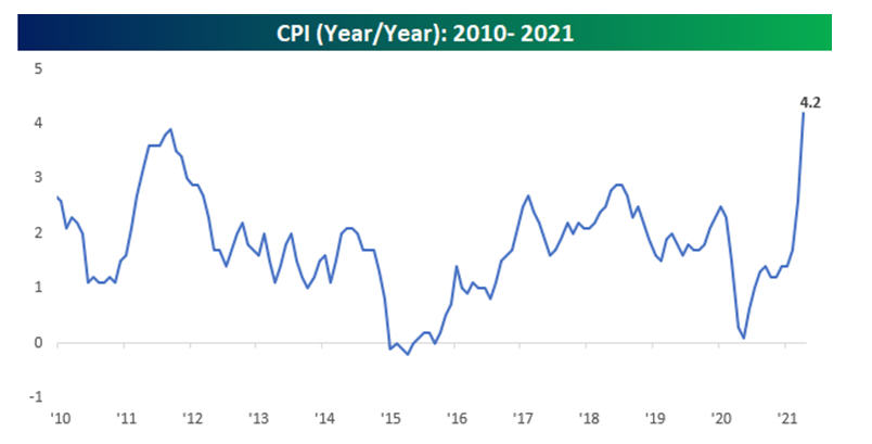
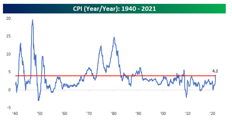
Below are charts, courtesy of Bespoke Investment Group, showing the year-over-year change in inflation the past 11 years, and for a longer term look, going back to 1940.
As one can see, going back to 2010, the CPI has rarely been above 2.5%. This period of low inflation goes back much further, though, to the early 1980s, where it’s been rare to see the CPI over 4%. See the chart below. Hence, some of the reaction in the stock market last week.
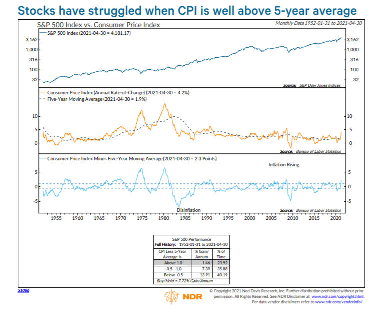
It remains to be seen how the inflation numbers will pan out in coming months. It shouldn’t be surprising to see higher comparisons against the depressed levels of economic activity last summer, when much of the nation was shut down. The question becomes, “How much of this is already priced into financial markets?” We’ll find out in coming months, but as Ned Davis Research shows in the chart below, when the CPI is well above its 5-year average (as it is now), stocks have performed poorly, with the S&P 500 losing an annualized -1.46%.
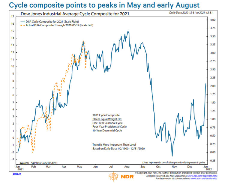
This may be a precursor to cyclical weakness in stocks, as projected by the Dow Jones Industrial Average Cycle Composite, with an expected peak in May, and perhaps a more important peak in July/August. Inflation is like the porridge in Goldilocks and the Three Bears. If it’s just right, everything’s good and markets behave pretty well. But, if it’s too hot (rising sharply above certain levels), it can burn your tongue.
Duration. What Is It, And Why Is It Important In Bonds?
Given the heightened interest in inflation expectations, it’s natural to ask what will happen to the bond market in a higher inflationary environment? That’s assuming one KNOWS that interest rates will actually be moving higher. That’s far from given, in that the Fed has pledged to keep overnight Fed Funds rates at or near zero for two more years. The Fed Funds rate, however, is not the bond market. The Fed does not control the 10-year Treasury Note, or the 30-year Treasury Bond, but they can certainly influence the yield with their unlimited buying power. All of this can morph into fears, or unproven myths, such as “Gold will go to $3000 an ounce,” or “I’m going to lose my ass in bonds. Get me out.”
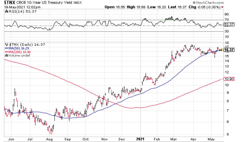
When bond yields move significantly in either direction, their expected return can be estimated by the duration of the bond (or the bond fund). Duration is a measure of the sensitivity of the price of a bond (or bond fund) to a change in interest rates. The technical definition is described as “the weighted average of the payments an investor will receive over a period discounted to the bond’s present value.” In the past 10 months, we’ve essentially had a sharp uptick in yields, with the 10-year Treasury Note increasing from 0.53% on July 31 of last year, to its present level of 1.64%. That is shown on the chart below, courtesy of www.stockcharts.com. Likewise, the yield on the 30-year Treasury Bond moved from 1.19% to 2.35%.
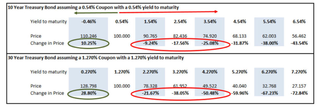
I found a very useful table from Steve Blumenthal at CMG Research, which is produced below, illustrating the expected negative return from notes and bonds for each 100 basis point increase (example, from 1.27% to 2.27%).
As you can see, a bump from 1.27% to 2.27% on a 30-year bond would produce an approximate -21.6% return. Likewise, an increase from 0.54% to 1.54% on a 10-year Treasury would produce an expected negative return of -9.2%. All of this is related to duration. Below, you’ll see not all funds act the same way. In the table, we’ve listed several funds we use, their duration, and their prices and total returns since July 31 of last year, coinciding with the sharp increase in yields.
| Fund or Index | Duration | Price/Yield on 7-31-20 | Price/Yield on 5-17-21 | Total Return |
| TNX 10-year Treasury Note | 0.53% | 1.64% | ||
| TYX 30-year Treasury Bond | 1.19% | 2.35% | ||
| TLT IShares 20+ Year TBond ETF | 18.45 years | 169.02 | 137.08 | -18.89% |
| IEF IShares 7-10 Year TBond ETF | 7.86 years | 121.99 | 114.15 | -6.42% |
| BHYIX Blackrock High Yield | 3.50 years | 7.228 | 7.82 | 8.19% |
| VBMFX Vanguard Total Bond Fund | 6.63 years | 11.572 | 11.21 | -3.12% |
| NERYX Loomis Sayles Core Plus | 5.67 years | 13.804 | 13.69 | -0.82% |
| FSHBX Fidelity Short Term Bond | 1.90 years | 8.699 | 8.74 | 0.47% |
| PIMIX PIMCO Income Fund | 2.11 years | 11.265 | 12.07 | 7.14% |
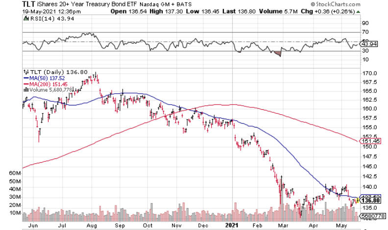
Below is a chart of the TLT, which has the longest duration of any of the funds listed above, at nearly 18.5 years. And, true to form, it has lost nearly -19% during the period. But, note that three of the funds actually turned a profit. Part of this is related to duration, but also the fund’s strategy. Fidelity Short Term Bond has a duration of just under 2 years, so there’s limited risk in that fund even if rates moved sharply higher. Both Blackrock High Yield and PIMCO Income earned 7-8% in the period. This is because they own different kinds of bonds. Blackrock is a junk bond fund, and high yield bonds benefit from a stronger economy, which the jump in yields was indicating. High Yield bonds are also closely linked to the stock market, and during this period, the stock market did really well. If yields were to increase from 1.64% today to 2.64%, coupled with a declining stock market, it’s quite likely Blackrock and other high yield bond funds would lose money, mostly a matter of how much.
In the case of PIMCO Income, the fund has a large position in non-agency residential mortgages, so it is not necessarily a traditional bond fund in the overall sense, and in this case, has a lot of money in strategies that benefit from rising interest rates. That won’t always be the case, as it depends on how fast rates rise, and from what levels. Within TABR’s bond allocations, 70% is allocated to high yield, with 15% in PIMCO Income and another 15% in Sierra Tactical Core Income (SSIRX). When our high yield bond fund risk models turn negative, we temporarily move that capital to short duration bond funds, similar to Fidelity’s. Overall, we think our process is well prepared for a rising interest rate environment, should that be the norm in coming years. Honestly, I hope we do get higher rates across the board, so that savers will once again get rewarded. But, I’m also realistic that the U.S. Government does not want interest rates to go too high, because there is so much total debt in the system, financial markets will crater if rates go too high.
Real Estate And Housing—A Seller’s Market
You’ve probably heard a variation of the following story in the past few months. “My friends listed their home on the market, and within 2 days, they had 15 offers, and all of them were above the asking price, some by as much as $30,000 to $50,000 higher. Plus, some came in with all cash, and waived the appraisal process.”
This isn’t “fake” news. It is happening, all over the nation. I can speak personally to that, as I recently completed the sale of my late Aunt’s home in the Fresno, CA area and am also aware of several other confirmed cases, in many different states. Yes, there are definitely supply issues, and interest rates are historically low, allowing one to purchase more home, but in many ways, the frenzy to pay substantially over asking prices is akin to the “get me in, I don’t care” attitude that is prevalent at major peaks. Right now, if you’re a Seller, you’re in Heaven, and if you’re a Buyer, you’re in Hell.
This got me to thinking about the subject in a bit of a different way. How have housing prices done over the long term, and is there a better way to invest than being a landlord and owning rental properties?
My first premise is that I don’t think one should necessarily look at their home residence as an investment. It’s where you live. There are intangibles in owning your own home that go beyond whether or not the house is worth more than you paid for it. Yet, for many people, their home may be their biggest asset (and that’s not typically a good thing, because it doesn’t produce any income).
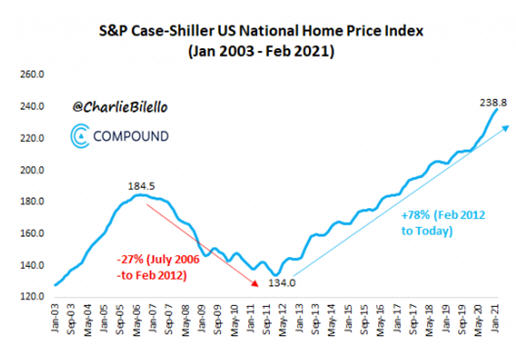
However, in this instance, we ARE looking at homes as investments, for comparative purposes. In the 1980s, Yale economist Robert Shiller, along with two colleagues, Karl Case and Allan Weiss, developed the Case-Shiller US National Home Price Index. The data goes back to 1953, although I can’t vouch for how accurate the data would be that far back. Below is a chart of the index going back to 2003, courtesy of Charlie Bilello of Compound Capital Advisors.
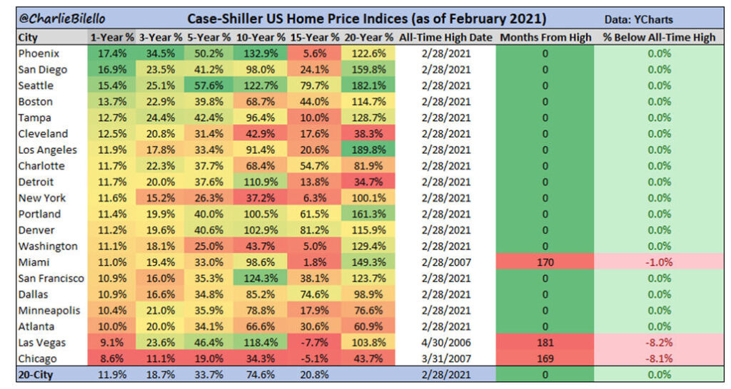
You can see the lengthy decline after the 2006 peak, bottoming in 2011/12, and it’s been straight up, with a recent acceleration. Charlie also created a table (below) showing the returns in 20 cities across the nation, during the last 1-year to 20-year periods. Every market except Las Vegas, Miami and Chicago are at all-time highs as of the end of February. During the last 20 years, the 4 largest appreciation gains have come from Los Angeles, Seattle, Portland and San Diego, ranging from 159% to 189%. In contrast, the bottom four were Cleveland, Detroit, Atlanta and Chicago, with gains from 34% to 60%.
Notably, location is really important in real estate, just like stock styles (large, small, foreign) are really important in the stock market. From December 1999 to December 2020, the National Home Price Index gained a compounded 4.20% per year. That’s probably not as good as you thought it would be.
Full transparency here. My bias, which I believe is supported with facts, is this—I don’t like rental real estate as an investment. I have no interest in being a landlord, or even paying a property manager to “manage” the property. That 4.20% per year is very close to the long term return on housing, before inflation, and that is only the case if one was an all-cash owner with no debt. Even then, one is not likely earning 4.20% net, because you have to throw in property taxes and maintenance.
Many real estate investors will say, hey, wait a minute. I’m leveraged 3 to 1. I only put up a third, and I rent the property out for more than my mortgage payments, and I get to write off everything—the mortgage interest, the expenses, and I even get to depreciate the property. Maybe so, but good luck showing me the real returns that are made over time, accounting for all of that. It’s quite messy, at best, and for 4.20% per year, no thank you. I don’t need the headaches. Oh, and did I mention the liquidity?
I’m not writing this to convince real estate aficionados that they’re wrong. We’re all different, and have different comfort levels and interests. The facts won’t sway that. Some of our clients have done well with rentals, and others have had painful, disastrous outcomes. Is there a better way? I think so. In my view, if one wants to invest in real estate beyond owning one’s own home, you should just buy a real estate fund.
There aren’t many real estate funds that have been around for 21 years, but I found two in the Vanguard Real Estate Index Fund (VGSIX) and the Cohen & Steers Realty Shares Fund (CSRSX). From December 1999 to December 2020, these funds earned compound returns of 10.30% and 11.0%, respectively. I’d say that’s a tad better than 4.20 for home prices. And it comes with no broken pipes, no unreliable tenants, and as of about 18 months ago, no commissions. However, don’t think you’re likely to make 10% a year for the NEXT 20 years.
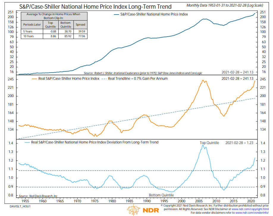
The chart below, courtesy of Ned Davis Research, shows the Case-Shiller Home Price Index back to 1953, with its real trendline and its deviation from its long-term trend. Prices are so extended into their top quintile that using past history, gains have averaged just 9% ten years later when in this mode. I don’t mean 9% compounded, I mean 9% total, which is less than 1% annually. Stocks and housing have become much more correlated in the last 20 years, and I expect that to continue.
Stocks Are Too Popular
We and others have written that the Federal Reserve Board, with their zero interest policy, have forced investors to take on more risk in order to earn decent returns. It’s often been said that stocks climb a wall of worry, and that you can’t have a major top in stocks without the public participating.
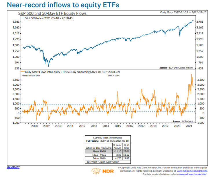
Well, worry no more, they are participating. According to published reports, net inflows into stock funds and ETFs in the last few months have exceeded the combined total of the last 12 years. This is aptly shown in the chart below from Ned Davis Research.
Since 2007, in this mode, the S&P 500 has declined at an annualized rate of -11%. Combined with the cycle chart above, maybe the day of reckoning is near. Our indicators have not confirmed this as yet, but when everybody wants in, it’s usually a good time to leave the party. At present, our high yield bond risk model remains firmly on its November 9 BUY signal, and 5 of our 6 risk models for the stock market are bullish, so equity allocations are around 83%.
Material Of A Less Serious Nature
A diet guru is holding a seminar in the conference room of a large hotel. “The food we eat is slowly killing us,” he explains. “Red meats attack the heart. Sugar leads to inflammation and diabetes. Vegetables and fruits are sprayed with harmful pesticides, which cause cancer. Even the drinking water in most parts of the country is polluted!”
He continued, “But did you know that there is a food that is much more dangerous than all of those examples? Can anyone tell me what that is?”
An older man in the back of the conference room raised his hand and answered, “Wedding cake?”
School is almost out (hurrah!) which also means that baseball is in full swing (double hurrah). I wonder how much one could have won in Vegas if before the season, you would have bet $1000 that after 42 games, the San Francisco Giants (yes, my SF Giants) would have the best record in the National League? I certainly didn’t expect it, but hey, nobody did, least of all, all you Dodgers fans out there (I know who you are!). Hey, I’m enjoying it while it lasts, hopefully all the way through October. The Giants can flat out PITCH. Pitching, unfortunately, is a foreign substance to my other team, the Angels. The Angels are NGE. In Damian Lillard terms, that means Not Good Enough.
Have a great Memorial Day, honoring the men and women who have died serving in our military.
Sincerely,
Bob Kargenian, CMT
President
TABR Capital Management, LLC (“TABR”) is an SEC registered investment advisor with its principal place of business in the state of California. TABR and its representatives are in compliance with the current notice filing and registration requirements imposed upon registered investment advisors by those states in which TABR maintains clients. TABR may only transact business in those states in which it is notice filed, or qualifies for an exemption or exclusion from notice filing requirements.
This newsletter is limited to the dissemination of general information pertaining to our investment advisory/management services. Any subsequent, direct communication by TABR with a prospective client shall be conducted by a representative that is either registered or qualifies for an exemption or exclusion from registration in the state where the prospective client resides. For information pertaining to the registration status of TABR, please contact TABR or refer to the Investment Advisor Disclosure web site (www.adviserinfo.sec.gov).
The TABR Model Portfolios are allocated in a range of investments according to TABR’s proprietary investment strategies. TABR’s proprietary investment strategies are allocated amongst individual stocks, bonds, mutual funds, ETFs and other instruments with a view towards income and/or capital appreciation depending on the specific allocation employed by each Model Portfolio. TABR tracks the performance of each Model Portfolio in an actual account that is charged TABR’s investment management fees in the exact manner as would an actual client account. Therefore the performance shown is net of TABR’s investment management fees, and also reflect the deduction of transaction and custodial charges, if any.
Comparison of the TABR Model Portfolios to the Vanguard Total Stock Index Fund, the Vanguard Total International Stock Fund and the Vanguard Total Bond Index Fund is for illustrative purposes only and the volatility of the indices used for comparison may be materially different from the volatility of the TABR Model Portfolios due to varying degrees of diversification and/or other factors.
Past performance of the TABR Model Portfolios may not be indicative of future results and the performance of a specific individual client account may vary substantially from the composite results above in part because client accounts may be allocated among several portfolios. Different types of investments involve varying degrees of risk, and there can be no assurance that any specific investment will be profitable.
The TABR Dividend Strategy presented herein represents back-tested performance results. TABR did not offer the Dividend Strategy as an investment strategy for actual client accounts until September/October 2014. Back-tested performance results are provided solely for informational purposes and are not to be considered investment advice. These figures are hypothetical, prepared with the benefit of hindsight, and have inherent limitations as to their use and relevance. For example, they ignore certain factors such as trade timing, security liquidity, and the fact that economic and market conditions in the future may differ significantly from those in the past. Back-tested performance results reflect prices that are fully adjusted for dividends and other such distributions. The strategy may involve above average portfolio turnover which could negatively impact upon the net after-tax gain experienced by an individual client. Past performance is no indication or guarantee of future results and there can be no assurance the strategy will achieve results similar to those depicted herein.
Inverse ETFs
An investment in an Inverse ETF involves risk, including loss of investment. Inverse ETFs or “short funds” track an index or benchmark and seek to deliver returns that are the opposite of the returns of the index or benchmark. If an index goes up, then the inverse ETF goes down, and vice versa. Inverse ETFs are a means to profit from and hedge exposure to a downward moving market.
Inverse ETF shareholders are subject to the risks stemming from an upward market, as inverse ETFs are designed to benefit from a downward market. Most inverse ETFs reset daily and are designed to achieve their stated objectives on a daily basis. The performance over longer periods of time, including weeks or months, can differ significantly from the underlying benchmark or index. Therefore, inverse ETFs may pose a risk of loss for buy-and-hold investors with intermediate or long-term horizons and significant losses are possible even if the long-term performance of an index or benchmark shows a loss or gain. Inverse ETFs may be less tax-efficient than traditional ETFs because daily resets can cause the inverse ETF to realize significant short-term capital gains that may not be offset by a loss.
For additional information about TABR, including fees and services, send for our disclosure statement as set forth on Form ADV from us using the contact information herein. Please read the disclosure statement carefully before you invest or send money.
A list of all recommendations made by TABR within the immediately preceding one year is available upon request at no charge. The sample client experiences described herein are included for illustrative purposes and there can be no assurance that TABR will be able to achieve similar results in comparable situations. No portion of this writing is to be interpreted as a testimonial or endorsement of TABR’s investment advisory services and it is not known whether the clients referenced approve of TABR or its services.

