Inflation Protection Is Hard To Come By
From the year 2000 to 2020, inflation in the United States as measured by the Consumer Price Index (CPI) averaged well under 3%. And about 3% inflation has been pretty much the average since 1950.
Nothing is forever, though, thanks to the seemingly unlimited printing press known as The Federal Reserve. As a result, inflation surged to 5.9% in 2021, and hit over 9% a couple of months ago, levels not seen since 1981.
But, worry not. Hasn’t anybody told you that equities are the best inflation hedge that man has invented? Didn’t you know that the real return on stocks (inflation-adjusted) is over 6% per annum, going back to 1926?
And then there’s gold. Heck yeah! A war in Russia. China testing nuclear weapons. The highest interest rates in over a decade. Highest inflation in 40 years. Gold prices to the moon!
Turns out, what you think you know, isn’t reality. As you’ll see below, there’s a lot more to the story. We’ll also touch on TIPS, Dividend Stocks, Where The Fed Is Going, Mid-Term Elections and Bad Breadth. By the end, you may need some humor, and of course, we’ll not disappoint.
Stocks As An Inflation Hedge
It’s generally accepted that in historical data, stocks since 1926 (when mostly accurate data began, in our view) have been the best asset class to own to outpace inflation. Better than bonds, cash and gold, and by a fairly wide margin. With inflation running at about 3.5% over the time span, and stocks gaining about 10% per annum, one ends up with an approximate 6.5% real return (after inflation). I’m certainly not here to argue that. However, I’ve observed that the vast majority of that “edge” has occurred while inflation was very mild. Turn up the heat, and you get a different narrative. The two most prominent periods of high inflation in U.S. history have taken place (thus far!) from 1941 to 1948, and again from 1969 to 1982.
Below, we’ve broken these periods down year-by-year in a table, showing the year, the inflation rate, and the total return (including dividends) of the S&P 500. I’ve also included a column for gold from 1969 to 1982 so we could also look at that asset. At the bottom, I’ve also included the data for 2021 and 2022 year-to-date.
| Year | Inflation | S&P 500 Total Return | Gold |
| 1941 | 5.0% | -11.59% | n/a |
| 1942 | 10.9 | 20.34 | n/a |
| 1943 | 6.1 | 25.90 | n/a |
| 1944 | 1.7 | 19.75 | n/a |
| 1945 | 2.3 | 36.44 | n/a |
| 1946 | 8.3 | -8.07 | n/a |
| 1947 | 14.4 | 5.71 | n/a |
| 1948 | 8.1 | 5.50 | n/a |
| Compound Return | 6.8% | 10.6% |
The period above encompassed World War II, and all of the spending associated with a war time economy. In the 8 year period shown, inflation compounded at nearly 7% per annum, but stocks handily beat that return, compounding at 10.6%, creating nearly a 400 basis point edge. Honestly, that’s pretty good. Below, we look at the period from 1969 to 1982.
| Year | Inflation | S&P 500 Total Return | Gold |
| 1969 | 5.5% | -8.5% | -16.07% |
| 1970 | 5.7 | 4.01 | 6.16 |
| 1971 | 4.4 | 14.31 | 16.37 |
| 1972 | 3.2 | 18.98 | 48.74 |
| 1973 | 6.2 | -14.66 | 73.49 |
| 1974 | 11 | -26.47 | 67.04 |
| 1975 | 9.1 | 37.2 | -25.2 |
| 1976 | 5.8 | 23.84 | -4.06 |
| 1977 | 6.5 | -7.18 | 23.08 |
| 1978 | 7.6 | 6.56 | 35.57 |
| 1979 | 11.3 | 18.44 | 133.41 |
| 1980 | 13.5 | 32.42 | 12.5 |
| 1981 | 10.3 | -4.91 | -32.15 |
| 1982 | 6.2 | 21.55 | 12 |
| Compound Return | 7.51% | 6.69% | 18.43% |
In this 14-year period, inflation compounded at 7.51% per annum, but stocks couldn’t keep up, trailing the CPI by nearly 1% per annum. That’s actually not a bad showing during the highest inflationary period in U.S. history. One nearly kept up their purchasing power. And, it amplifies my point—the edge for stocks takes place during low and disinflationary periods, not in high inflation periods. But, not all low inflation periods are great for stocks. Stocks went virtually nowhere for nearly 10 years in the 2000 to 2009 period, which was not marked by high inflation at all, but rather by a bubble in first technology stocks and then in housing.
Gold deserves a separate mention. The price of gold was fixed at $35 per ounce until the early 1970s. In 1974, the U.S. lifted its 40-year ban on the private purchase of gold, and in 1978, along with most other nations, officially abandoned the gold standard. Like a pot of boiling water with the lid on, once the government lifted the price cap on gold, its price soared, topping out at near $800 per ounce in 1980. As a result, in the 14-year period shown above, gold looks like the perfect inflation hedge, as it compounded at over 18% per annum. In my opinion, this period created a myth that many people today still seemed anchored to, that gold is an inflation hedge. I don’t agree with that notion. Even WITH this performance, gold has barely performed better than Treasury Bills and inflation over time, and I believe the performance attained in the 1969-82 period was artificial, thanks to price caps. Here’s something else that’s pretty important. In that time period, you couldn’t have easily invested in gold even if you wanted to. There was no easy way to own it, as there is today, via ETFs (exchange traded funds) which own the gold for you.
Since the 1980 peak at $800 per ounce, today gold trades around $1,675, which compounded equals 1.8% per annum for 42 years. Thank you, but that’s an inflation hedge I can do without. We are 21 months into this latest period of very high inflation. Through September of 2022, inflation is up 13% in the last 21 months, the S&P 500 is up less than 5% during the same period, and gold is down (-13%). There is no telling how long this cycle may last. Using year-over-year comparisons of the various components that make up the CPI readings, some analysis suggests that as high readings get removed from the data from 12 months ago, we may be looking at year-over-year inflation numbers by March to June of 2023 that actually get back down to the 3-4% range. We’ll just have to see. My main message in looking at the data like this is simply that yes, stocks are a really good inflation beater over the very long run, but there are long periods in history where that’s not the case. Nothing works in all environments. With very high inflation and rising interest rates and surging energy prices, this period is thus far very similar to the 1970s. Combine that with very high stock market valuations entering this year, and we have one of the toughest investing environments in over 40 years. We’ll get through it, but buying and holding (or hoping, as some say) isn’t likely to work very well until stocks and bonds are really cheap again. They’re getting there.
Are Dividend Stocks The Answer? Maybe
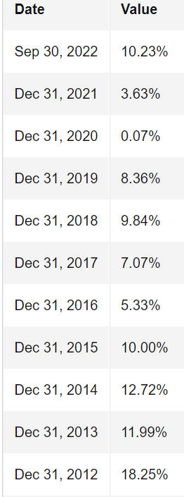
One of the possible solutions to combat inflation is to invest in stocks that pay dividends, or in the case of today’s trends—stock funds or ETFs that invest in stocks that pay dividends, using certain criteria. The thought here is that companies will grow their earnings over time, and as they do, they will grow their dividend income, and this income stream will outpace inflation. For the most part, this is true, but the income stream can at times be very bumpy, typically during severe market declines. Below is the annual dividend growth rate of the S&P 500 going back to 2012.
I didn’t have room to show it, but in 2009, which was the year stocks bottomed after their nearly 18-month, -56% decline, dividend growth was (-21.07%), as many companies had to cut or eliminate their dividend. This also took place in 2020, but the falloff overall was not quite as severe. We examined year-to-year payout data on one of the most popular dividend-oriented ETFs, the S&P Dividend ETF (symbol SDY), which is actually in our portfolios at this time.
For its selection criteria, the managers use the universe of the S&P 1500 Index, which is comprised of large stocks, mid-caps, and small stocks. It favors more reliable dividend payers rather than pure high yielding dividend plays, and each company in the portfolio must have increased its annual dividend in each of the past 20 years. If you think that rule would ensure constant, growing income, you should think again. Below is the annual payout per share of the fund, going back to the full year of 2006 (the fund started in 2005).
| Year | Payout Per Share of SDY |
| 2006 | 1.769 |
| 2007 | 1.968 |
| 2008 | 2.20 |
| 2009 | 1.73 |
| 2010 | 1.74 |
| 2011 | 1.73 |
| 2012 | 1.90 |
| 2013 | 1.64 |
| 2014 | 1.786 |
| 2015 | 1.95 |
| 2016 | 2.23 |
| 2017 | 2.099 |
| 2018 | 2.44 |
| 2019 | 2.639 |
| 2020 | 3.02 |
| 2021 | 3.39 |
| Compound Growth Rate | 4.4% |
Notice that in 5 of the 16 years, dividend payouts were either flat, or negative. That’s just part of investing. It’s very much like our clients who favor rental properties, or even commercial properties. Do you think your rental income goes up every year? Not when a tenant leaves. We’ve had clients whose rental properties have been without tenants for six months to a year. Poof. It happens. And, oh, by the way, the value of your rental won’t go up every year either, and neither will the value of a dividend-oriented mutual fund or ETF.
In fact, the drawdowns can be quite substantial. In the case of SDY, its worst drawdown was predictably from June 2007 to March 2009, when the price of the fund, including dividends, dropped (-54.7%). Then, in the pandemic of 2020, the fund lost (-36.6%) in 37 days. Only if you held tight and didn’t sell did you achieve the 4.4% dividend growth rate described above. So, there are solutions to battle high inflation, but everything comes with a price. There’s no free lunch, although I’m told Costco gets pretty close with their $1.50 hot dog lunch!
TIPS On TIPS
Much ink has been spilled this year on the investment product known as TIPS (Treasury Inflation Protected Securities). Everyone’s ears perked up earlier this year when it was reported that one could earn over 9% pretty much risk-free by investing in these bonds. However, unless you want to purchase a mutual fund that specializes in these bonds, buying them individually isn’t necessarily easy for investors unless they are using an advisor who has access to the bond market through their custodian. Purchasing them direct through the U.S. Treasury website is clunky at best, so if you enjoy challenges, knock yourself out.
One might think if you’re purchasing inflation-protected bonds, you’d be guaranteed to beat inflation. Guess what? It doesn’t work that way. They gain and lose value just like all bonds do, based on what is happening with interest rates. Capital depreciation, such as in this historic year, can easily demolish any inflation adjustment. If one is looking for pure safety, buying and holding TIPS bonds until they mature is about as safe as you can get. Honestly, though, in my view, they’re complicated and a bit over-rated. Have they done better than traditional bonds?
In our Passive Index account which holds a mix of Vanguard funds, we own both Vanguard Inflation Protected Bond (VIPSX) and the Vanguard Total Bond Index Fund (BND, the ETF version). In the last 10 years, VIPSX has compounded at 0.88% annually vs 0.67% for BND, and the comparison going back 15 years is 3.02% vs 2.47%. So, the data does show a small edge. But, this isn’t enough to make game-changing portfolio decisions. I have better uses of my time than understanding the complications of how TIPS work.
As a result, I’m not going to write a tutorial here. Rather, I found a really great piece on this subject, and provided the link below. It’s titled, “All About TIPS: Real Returns And Inflated Expectations.” I’d like to give full credit to the author, as they did a really good job, but I cannot find the source, other than the website is www.portfoliocharts.com.
Here’s the link to the article: portfoliocharts.com/2022/09/27/all-about-tips-real-returns-and-inflated-expectations/
Happy Reading!
Social Security COLA, A Medicare Premium Reduction And An Increase In The Annual Gift Exclusion
Starting in January 2023, Social Security checks will be 8.7% larger, thanks to the biggest cost-of-living adjustment in 40 years. We’ve got certain clients who have earned large monthly benefits who will be receiving nearly $5000 more per year. You might assume that Medicare premiums would also soar, as they did in 2022, rising 14.5%, but in a quirk, they will actually decline in 2023 by (-3%), in part because the CMS (Centers for Medicare & Medicaid Services) needs to accumulate reserves against the cost of a newly approved Alzheimer’s drug, Aduhelm.
A few other tidbits. For those of us working and earning at least $160,000, welcome to another tax increase. The maximum amount of earnings subject to the Social Security tax (6.25% for employees, another 6.25% from the employer) will increase to $160,200 next year, up from $147,000. That’s an additional $13,000 subject to the tax, or $825 on each side. As the Social Security Trust Fund teeters on the verge of insolvency, defined as being able only to provide about 75% of promised benefits starting in 2032, expect to hear about further “solutions” from Congress to tax high income earners even more, and possibly lift the maximum tax to “unlimited.”
By the way, if you’re wondering, like I have been, where the money comes from to increase the COLA, look no further. The Federal Government doesn’t have this money, so they’ll just continue to print more. I’ve been unable to find any sources that can accurately estimate how much this will cost, but my very wild guess is in the hundreds of $billions. Inflation, indeed.
Lastly, and I won’t print them here, but the IRS did adjust the various tax brackets for inflation as they normally do, and they did increase the annual gift exclusion from $16,000 to $17,000. So, beginning next year, anyone can give to anyone else (not just your children, or relatives) up to $17,000 per person without having to report the gift with a tax filing. Gifts above that number are not taxable, but would count against one’s lifetime exclusion, which has now been increased to $12.92 million.
Where The Fed Is Going With Interest Rates
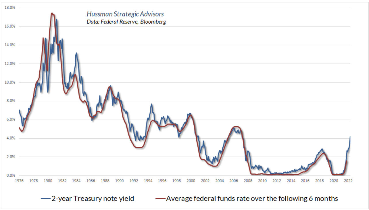
At present, the Fed Funds rate is 3% to 3.25%, and the Fed’s next meeting will be November 1 and 2, where it is a virtual certainty they will raise raise another 75 basis points to the 3.75% to 4% range. How high will they go before they are done? And, has the market priced this in? With the former, one can look to the leading tendency of the yield on the 2-year Treasury Note, shown below, courtesy of money manager John Hussman, at www.hussmanfunds.com.
As Hussman noted in recent market comments, the yield on the 2-year Treasury has led the path of federal funds pretty well going back to 1976. As I write this, the 2-year Note is yielding 4.62%, so it is probable that Fed Funds will get to at least this level, and possibly as early as December, which would necessitate another 75 basis point hike. Plus, there’s no indication that 2-year yields have peaked. Though the Fed has been pretty transparent that they need to tackle inflation by raising rates to curtail demand, nobody knows how high they will go. Many parts of the yield curve have already inverted, meaning short term rates have risen above long term rates. For instance, today the 10-year Treasury yield is at 4.22%, a full 40 basis points below the 2-year yield. Inversions such as this normally are harbingers of a coming recession, but the most reliable historical inversion combination compares the yield on three-month Treasury Bills to that of the 10-year Treasury Note. That’s not inverted yet, with 3-month paper today at 3.99%. I expect this to eventually take place in the next two months.
At some point, these increases in yields will be priced into both stocks and bonds, and markets will begin to look forward. I don’t think we’re there, but the lower we go (and higher in yields we go), the closer we’re getting. Anecdotally, it doesn’t appear that confidence in stocks has been dented, at least not with the investing public. The American Association of Individual Investors (AAII) conducts a weekly poll of their members portfolio allocations. Equity allocations are still above 63%. At the 2002 and 2009 market bottoms, that figure was 40%. Interest rate changes, both up and down, take many months to filter into the economy and businesses. We are just beginning to see a very marked slowdown in housing, thanks to mortgage rates approaching 7%, after being below 3% for much of 2021. We are in the midst of quarterly earnings reports starting this week and going out another 3 weeks or so.
As inflationary pressures mount, along with rising interest expense and pressure on business margins, we should eventually expect this to begin showing up in poor quarterly earnings comparisons. That hasn’t happened yet, let alone capitulation, which would be marked by selling regardless of value. As you’ll see below, there’s reason for some hope in the short term, but its very plausible that the worst of this bear market still lies ahead.
Mid-Term Elections And An Oversold Market
From time to time, I’ve featured research on the seasonal tendencies of the stock market. One of the more popular strategies is the best six months of the year, and the worst six months. Sell in May and go away. This one in particular is quite prominent, even with information being freely available today, unlike 20 years ago. Since 1950, being invested from November to April has captured nearly the entire return of the stock market. Being in cash from May to October has avoided some lousy periods. Obviously, nothing works all the time. But the negative period is working quite well in 2022, with the S&P 500 currently down nearly (-11%) since April 29. Which brings us to the favorable period, which is due to start in just a couple of weeks. Combining favorable seasonal trends with the Presidential Cycle research results in some interesting feedback.
Historically, mid-term election years have provided the lowest stock market returns of the four years of the Presidential Cycle. Alert. Pre-Election years, which will be 2023, have provided the BEST stock market returns. When you’re coming off a big down year, which seems likely with two plus months to go, and entering a time when the seasonal odds are favorable, combined with an oversold market, it would behoove one to pay attention.
Below is the performance of the S&P 500 from November to April in every mid to pre-election year since 1950. The data and concept are courtesy of David Steets at www.systematicindividualinvestor.com. He writes an excellent, very detailed and researched letter which is published weekly.
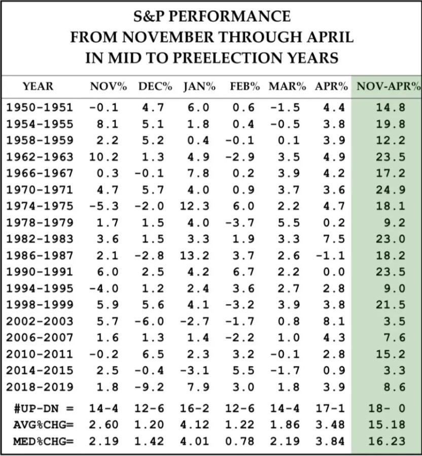
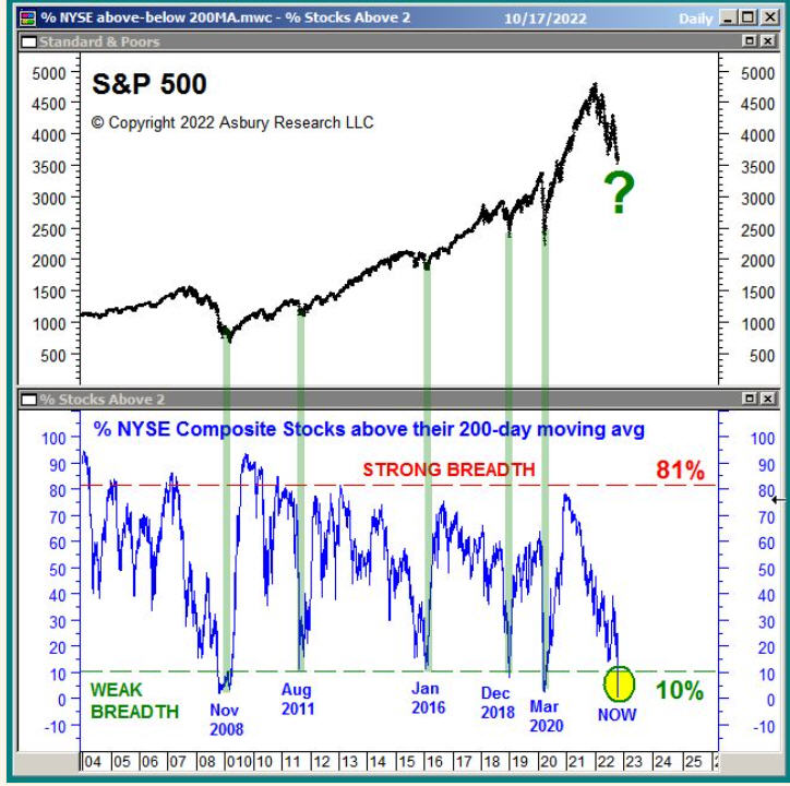
As you can see, there have been 18 occurrences since 1950, and the S&P 500 has earned positive returns in every period, with median gains of 16.2%, and the worst outcome being a 3.3% gain. So, there’s some hope, especially when coupled with the oversold condition which is noted below. But, here’s a balanced warning. Records are made to be broken, and this one will be at some point, maybe in the next six months. There is no statistical significance in looking at 18 data points. But, it is a favorable combination. The chart below, courtesy of my friend John Kosar at www.asburyresearch.com, shows the percentage of stocks in the NYSE Composite that are trading above their 200-day moving averages. This figure is now below the 10% level, a zone which in the past 18 years has marked important bottoms, including the one in November of 2008. That, however, doesn’t guarantee a bottom. In that time period, stocks rallied, and then plunged to further new lows during the first quarter of 2009, ultimately finding their bottom in late March. I think a similar path is very plausible here, if in fact stocks respond to these conditions.
Bad Breath (As In Market Breadth)
Market technicians are always looking for clues to help determine when market trends are beginning or ending. The focus is on what the market is actually doing, not what you think it should be doing. Among other indicators, a lot of focus is on market breadth, which helps determine the participation in a market rally or decline. This involves looking at market breadth indicators, such as the advance/decline line, the number of stocks making daily or weekly new highs or lows, and the percentage of stocks above certain moving averages, such as the 50-day, 150-day or 200-day. In a decline such as the one the market is experiencing now, its important to watch for divergences as market indexes make new price lows, to see if market breadth is confirming the new low by continuing to expand, or if there is some sign of slowing momentum, which in the case I’m showing below, seeing if the number of stocks making new lows is lessening, which would mean fewer stocks are participating in the decline as indexes recede to new lows.
Mind you, not all market bottoms have divergences, and not all market tops have divergences, but the vast majority do, in the range of 85-90%. In today’s case, I am seeing some hope, but also seeing some confirmation, which is a mixed bag. The hope is below, in the form of the chart showing new lows with the NASDAQ, which has continued to make new lows. The charts are courtesy of www.decisionpoint.com.
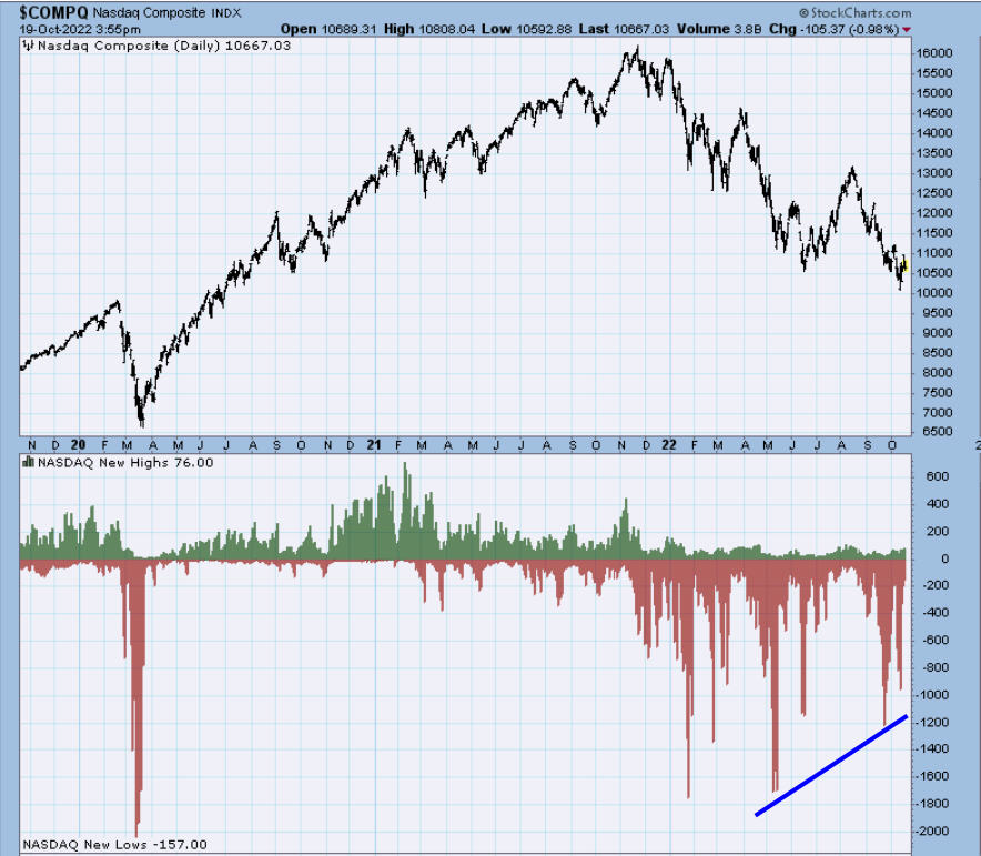
At the May bottom, there were over 1600 stocks on the NASDAQ making new lows. This number receded at the June low to just under 1200, and now more recently at the October lows, has improved further to about 950. The NASDAQ has been the hardest hit part of the market, as it is dominated by technology and growth stocks, the stars of the bull market. They are now taking the brunt of the beating. But it is encouraging that new lows are receding, even as the price indexes slide to new lows. Also, it is helpful if the time evaporated between lows is longer than just a couple of weeks. A few or several months is even more meaningful. We’ll be watching this as coming weeks unfold. On the negative side, though, is what I consider to be confirming bad breadth on the NYSE, which is shown below.
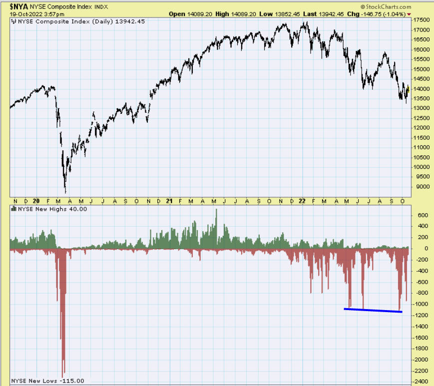
The similar recent lows in the NYSE Composite showed nearly 1100 stocks making new lows, and this was slightly greater than the amount seen at the June lows. This is called confirming breadth to the downside. As a result, I believe the stock market has more unfinished business to the downside, either immediately ahead, or perhaps sometime in the first quarter of 2023, after a fall/winter rally. Obviously, if our stock and bond market risk models change into more positive modes, we’ll follow them, but based on what I see, a durable stock market bottom is unlikely from current levels. My best guess as to a level is around the 3200-3300 level on the S&P 500, which represent two things–this zone marked the prior highs in stocks before the Covid crash, and it would also represent a 61.8% retracement of the entire advance from the March 2020 low.
Current Portfolio Allocations
We’ve had very little activity in accounts during the last 6 weeks. One of the valuation indicators we track ticked into its barely bullish zone in late September, and we have been looking for substantial weakness in order to bump our Moderate allocations up from 55% maximum stocks to 60%, and Aggressive from 70% to 80%. As a result, we added a very modest 2% slice to our equity allocations, and for Moderate accounts, they now stand at around 27%. When looking at an entire Moderate account, this means net equity exposure is around 14%. We have no tactical exposure, as all five of our stock market risk models remain solidly negative. Conservative accounts have equity exposure at about 11%.
In fixed income, we are at a maximum conservative position, with our high yield bond risk model negative, and core bond models negative. When in this position, we stay in ultra-short bond funds, and in this environment, it has been really important to be as short duration as possible. In the past 6 weeks, the yield on the one-year Treasury Bill has surged from 3.00% to 4.07%. In that time span, the Vanguard Total Bond Index Fund (VBMFX) has lost over -6%. Nearly all of the ultra-short funds we are in are either flat, or down between 20 and 50 basis points (-0.20%, for example). As I write this, the yield on the 10-year Treasury Note has broken out above long-term resistance at the 4% level, and sits at 4.22%. This is the highest level since 2007. We are in an environment that the vast majority of investors have never experienced before—high inflation and rising interest rates. This last happened in the 1970s, as I noted above, and since I’m about to turn 65 next month, that means that people my age and beyond were in their teens or 20s, at best. We certainly didn’t have any money to invest then. Though we weren’t “investing” during that time period, we’ve put a lot of thought into the processes of our investment models, realizing that markets change over time. Markets can also do things that most of us can’t imagine. This is why we rely heavily on trend-following approaches. Nobody can forecast the future, and we don’t need to, with a sound risk management plan in place.
Material Of A Less Serious Nature
Ladies, if you come across a man who is smart, hot, humble, educated, financially secure, passionate and patient, great at fixing things around the house and is not materialistic, good in bed, loves you like you are the only girl in the world and watches you while you are applying your make up while listening to every word you say. . . .then, please be assured that the weed you have just smoked is of super quality.
A man in northern Minnesota woke up one morning to find a bear on his roof. He looked in the Yellow Pages (remember those?), and sure enough, there was an ad for “Up North Bear Removers.” He called the number and the bear remover said he’d be over within an hour.
The bear remover arrived and got out of his van. He had a ladder, a baseball bat, a 12-gauge shotgun, and a mean-looking, heavily scarred pit bull. “What are you going to do?” the homeowner asked.
“I’m going to put this ladder up against the house, then I’m going to climb up and knock the bear off with this baseball bat. When the bear falls off the roof, the pit bull is trained to grab his testicles, and not let go. The bear will then be subdued enough for me to put him in the cage in the back of the van.”
He then handed the shotgun to the owner. “What’s the shotgun for?” the homeowner asked.
“If the bear manages to knock me off the roof, you shoot the dog.”
Given the last couple of weeks, I guess I must have solace in the fact that the Dodgers only played 4 more games than the Angels or Giants. I guess that’s why they call it Dodger Blue. Oh well, only one baseball team goes home happy. Maybe it will be the miracle Padres. Something strange is going on in Los Angeles. The UCLA football team is 6-0, and ranked in the top 10, even ahead of USC, who isn’t too shabby either. Of course, now that I’ve written that, the Bruins will probably lay an egg this Saturday in Eugene against the Oregon Ducks. Hopefully not, though. My favorite time of the year. Football and hockey. My 49ers are trying to stay dominant with massive injuries. We’ll see. My Dallas Stars have started the NHL season 3-0. Exciting, and encouraging. We’ll see. Just looking for little victories among what we’re all dealing with right now. Like, bacon and eggs and toast and coffee at the Pancake House for $25 (nice tip included). Yep, inflation, 2022 style. Get used to it. As always, thanks for being with us, and your trust in us.
Sincerely,
Bob Kargenian, CMT
President
TABR Capital Management
TABR Capital Management, LLC (“TABR”) is an SEC registered investment advisor with its principal place of business in the state of California. TABR and its representatives are in compliance with the current notice filing and registration requirements imposed upon registered investment advisors by those states in which TABR maintains clients. TABR may only transact business in those states in which it is notice filed, or qualifies for an exemption or exclusion from notice filing requirements.
This newsletter is limited to the dissemination of general information pertaining to our investment advisory/management services. Any subsequent, direct communication by TABR with a prospective client shall be conducted by a representative that is either registered or qualifies for an exemption or exclusion from registration in the state where the prospective client resides. For information pertaining to the registration status of TABR, please contact TABR or refer to the Investment Advisor Disclosure web site (www.adviserinfo.sec.gov).
The TABR Model Portfolios are allocated in a range of investments according to TABR’s proprietary investment strategies. TABR’s proprietary investment strategies are allocated amongst individual stocks, bonds, mutual funds, ETFs and other instruments with a view towards income and/or capital appreciation depending on the specific allocation employed by each Model Portfolio. TABR tracks the performance of each Model Portfolio in an actual account that is charged TABR’s investment management fees in the exact manner as would an actual client account. Therefore the performance shown is net of TABR’s investment management fees, and also reflect the deduction of transaction and custodial charges, if any.
Comparison of the TABR Model Portfolios to the Vanguard Total Stock Index Fund, the Vanguard Total International Stock Fund, the Vanguard Total Bond Index Fund and the S&P 500 Index is for illustrative purposes only and the volatility of the indices used for comparison may be materially different from the volatility of the TABR Model Portfolios due to varying degrees of diversification and/or other factors.
Past performance of the TABR Model Portfolios may not be indicative of future results and the performance of a specific individual client account may vary substantially from the composite results above in part because client accounts may be allocated among several portfolios. Different types of investments involve varying degrees of risk, and there can be no assurance that any specific investment will be profitable
For additional information about TABR, including fees and services, send for our disclosure statement as set forth on Form ADV from us using the contact information herein. Please read the disclosure statement carefully before you invest or send money.
A list of all recommendations made by TABR within the immediately preceding one year is available upon request at no charge. The sample client experiences described herein are included for illustrative purposes and there can be no assurance that TABR will be able to achieve similar results in comparable situations. No portion of this writing is to be interpreted as a testimonial or endorsement of TABR’s investment advisory services and it is not known whether the clients referenced approve of TABR or its services.

