Party Like It’s 1999
I was dreamin’ when I wrote this
Forgive me if it goes astray
But when I woke up this mornin’
Could’ve sworn it was judgment day
The sky was all purple
There were people runnin’ everywhere
Tryin’ to run from the destruction
You know I didn’t even care
Say say
Two-thousand-zero-zero party over
Oops out of time
So tonight I’m gonna party like it’s 1999
I’m sure many of you may recognize those lyrics. They are the first three stanzas from Prince’s hit single, 1999. The irony, though, is he released the song in September 1982, in hindsight when perhaps the biggest bull market in history was embarking, only to peak just three months after December 1999.
Today, after the quickest bear market decline in history, followed by the quickest large recovery in history, parts of the stock market are indeed partying like it’s 1999. Much like today, key stocks dominated the Nasdaq 100 and the S&P 500. And, growth stocks were smashing value stocks, much like today. The Nasdaq Composite gained over 85% in 1999, the largest gain ever for a major stock market index.
The party didn’t end well. Will this one be different?
The Bullet Proof Fabulous Five
Three years ago this month, we did a feature story on the five companies that Wall Street had dubbed the FAANG stocks—Facebook, Amazon, Apple, Netflix and Google (now known as Alphabet). Later, Microsoft was added to the mix and somebody called them FANMAG. For consistency, we’re going to leave Microsoft out of the lookback, which we actually said we would do three years later. Here we are.
This is relevant because these stocks were leading the market three years ago, and appeared invincible. Today, five months into the worst pandemic the world has seen in over 100 years, they are still leading the market and have actually benefited from COVID-19, unlike the majority of companies. First, though, let’s take a quick look back.
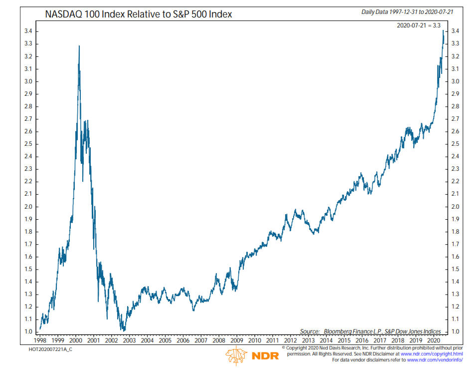
The chart below, courtesy of Ned Davis Research (www.ndr.com), shows the Nasdaq 100 Index relative to the S&P 500, back to the beginning of 1998. At that point, the indexes were even, but in two years, the NDX 100 rose to 3.3 times that of the S&P 500. Then it all came crashing down, with the Nasdaq index losing over -85% of its value in three years, and the S&P 500 losing nearly -50%. Today, this ratio is even higher than the peak in 2000, recently reaching 3.4. As a result, some analysts think this is a sign of excess speculation, and another bubble.
Let’s examine how the stocks have done in the past three years. Below, we’re going to show their performance, alongside estimates from Value Line at that time, current Value Line estimates, and current Technical Ranks.
| Stock | YTD Change | Aug ’17 Price | Today | 3-Year Price Chg | VLine Estimate ’17 | VLine Estimate Today* | TechRank* |
| +23.59% | 170.75 | 253.67 | +48.56% | +10% – +21 | +18% – +31 | 4 | |
| Apple | +44.7 | 159.85 | 425.04 | +165.89 | +4% – +11 | +2% – +7 | 5 |
| Amazon | +71.26 | 983.30 | 3164.68 | +221.84 | +4% – (-6) | +5% – +16 | 4 |
| Netflix | +51.08 | 171.00 | 488.88 | +185.89 | +6% – (-4) | (-1%) – +9 | 4 |
| +11.09 | 938.93 | 1487.95 | +58.47 | +7% – +13 | +16% – +22 | 4 | |
| S&P 500 | +1.24 | 2465.84 | 3271.12 | +32.65 | n/a | n/a |
*the estimates from Value Line are what is called their Median Appreciation Potential over the next three to five years, and are expressed in annualized compound numbers. Example—three years ago, their best case for Amazon was 4% annual gains and worst case was -6% annual losses. The Technical Rank is a system from Dorsey Wright which ranks stocks on five technical attributes (all of which are related to price). A 0 is the worst rank, and a 5 is the best. Note that prices do not include dividends, but the only stock of the five which pays a dividend is Apple, and that is at only 0.85%. The S&P 500 Index was included for comparative purposes, and yields just under 2%, and this would add about 6% in appreciation to the above 32% three-year price gain.
The “worst” of the five stocks has been Facebook, which has still compounded at just over 14% during the period, still ahead of the S&P 500 at around 12% per annum. The big winners have been Amazon, Netflix and Apple, compounding at 48.3%, 42.5% and 39.1%, respectively. I should note that all five stocks also had a Technical Rank of either 4 or 5 three years ago, and little has changed in that regard. A high technical rank does not preclude stocks from going down, but rather is a measure of relative strength, which measures price performance against market indexes and companies in similar industries.
The big question is—are these gains sustainable? One huge difference between 1999 and today is the level of interest rates. In December of 1999, the yield on the 10-year Treasury Note was 6.43%. This yield closed last week at 0.53%, a decline of over -91%. That is certainly one of the factors behind the massive performance edge that growth stocks have been enjoying versus value stocks these past 10 years or so. Let’s look under the hood a bit with Amazon, the market leader.
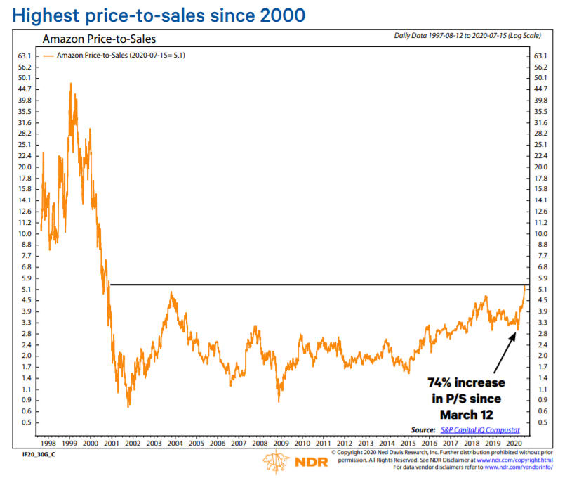
Above is charted the price/sales ratio for Amazon back to 1997, courtesy of Ned Davis Research. Since early March, this ratio has increased 74%, while actual quarterly revenue in the first two quarters of their fiscal year has grown by 26% and 40%. That’s an astounding number for a company with four-quarter sales likely going over $300 billion. For perspective, sales back in 2000 were near $3 billion.
The question becomes—at what price is all the good news priced into the stock? In September 2003 when the price/sales ratio approached the current level, the stock was $50 per share. Over five years later, in the midst of the 2007-2009 financial crisis, the stock traded at $35. This is a reminder that it’s possible to pay too much for even a great company.
Much like the NDX 100 ratio is at an all-time high, currently the five largest stocks in the S&P 500 represent 23% of the index. In 2000, this extreme was at 16%. With interest rates at all-time lows, price/earnings ratios have continued to expand in the past 20 years. Can this pattern continue, indefinitely? That’s probably not a good bet. Fund manager John Hussman calculated that if the S&P 500 were to drop by -50% and the largest stocks were to go back to comprising 16% of the index, where they were as recently as 2019, the implied loss for these stocks would be about -65%.
That’s not a forecast. Right now, these stocks are partying like it’s 1999. Psychology is ebullient and trends are up. Where they go, the overall market will likely follow. Let’s hope that March of 2000 isn’t right around the corner.
Why Were Agnostic Towards The Growth/Value, Large/Small and U.S./Foreign Stock Allocation Questions
Three dominant themes have been going on for several years in the stock market. Growth stocks are beating the pants off of value stocks, large stocks are doing much better than small companies, and U.S. stocks are outperforming foreign stocks by wide margins.
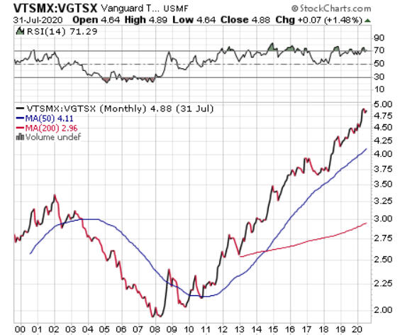
Is this important? Perhaps only if one is trying to get the most bang for their buck. Otherwise, the industry standard is to diversify, own some of everything, and let it be. In TABR’s Passive Index account, that is pretty much what we do. We own almost equal amounts of large, mid-cap and small-cap indexes, with no emphasis on growth or value, and our domestic stock exposure is 75% of the equity total, with 25% allocated to foreign stocks. We would be willing to go up to 50% foreign stocks in this account when the relative strength evidence favors foreign stocks, but that hasn’t been the case for nearly 10 years now. See the ratio chart below where we compare the Vanguard Total Stock Market Index Fund to the Vanguard Total International Stock Index Fund (courtesy of www.stockcharts.com).
Clearly, these patterns can persist for many years, before reversing (that’s why they call it mean reversion). Below is a table which shows the Value and Growth premiums over 5-year rolling periods, back to 1990. This data and table is courtesy of Craig Israelsen, Phd, developer of the 7Twelve Portfolio.

Though the table only goes through 2019, counting this year, since 2005, there have been 36 five-year rolling periods using large-cap, mid-cap and small-cap equity, and value indexes have only had the edge in 6 of those 36 periods. Today, that gap is as wide as ever.
We have no idea when this trend will end, nor when foreign stocks will begin to do better than U.S. stocks. But, we don’t need to. The market will tell us. It’s all about looking at the data, and using it in the correct way. Relative strength is our preferred methodology for this area, because it is dynamic, adaptive, and agnostic.
We had Ned Davis Research take our methodology back to 1995, as far back as the data would permit, and the results are shown below. We use a universe of 22 broad market indexes. Relative strength is about owning what is doing the best. We own top-ranked ETFs until they fall below certain thresholds in the rankings, then systematically swap them out for higher ranked ETFs that we don’t own. It’s rinse, repeat. Rinse, repeat. Follow the process.
The results in the study go back to 1996, and we’ve been using this approach in real time since late 2014. For the entire period through October 2019, the methodology beat the S&P 500, 11.6% per annum vs 8.84%, an advantage of over 31%. For additional context, in that same period, the Vanguard Total International Stock Index Fund gained 4.7% per annum.
Of course, the model doesn’t add value every year. Nothing does. It’s about trusting the work and sticking with it, especially after a year like 2017, when it lagged the index by nearly 800 basis points (see the yearly results below).
| Year | Model | S&P 500 Total Return |
| 1996 | 15.99% | 22.87% |
| 1997 | 31.42 | 33.21 |
| 1998 | 27.44 | 28.49 |
| 1999 | 32.58 | 20.96 |
| 2000 | -2.94 | -9.20 |
| 2001 | 8.07 | -11.89 |
| 2002 | -17.04 | -22.12 |
| 2003 | 53.93 | 28.54 |
| 2004 | 16.20 | 10.77 |
| 2005 | 6.49 | 4.76 |
| 2006 | 19.31 | 15.63 |
| 2007 | 14.13 | 5.35 |
| 2008 | -41.50 | -36.99 |
| 2009 | 28.13 | 27.01 |
| 2010 | 16.89 | 15.00 |
| 2011 | -0.79 | 1.91 |
| 2012 | 16.38 | 15.72 |
| 2013 | 28.49 | 32.22 |
| 2014 | 10.29 | 13.53 |
| 2015 | 4.24 | 1.28 |
| 2016 | 17.61 | 11.88 |
| 2017 | 13.87 | 21.72 |
| 2018 | -4.44 | -4.50 |
| 2019 | 29.45 | 31.33 |
Thus far in 2020, with the exception of January when one of our three stock ETFs was the S&P 500 Value Index, our equity exposure has consisted of the QQQ (NDX 100), the IVW (S&P 500 Growth Fund) and the OEF (S&P 100 Index). As we’ve been describing, the disparities in performance have been pretty stark. Through July 31, the three ETFs in previous order have gained 25.49%, 15.42% and 5.40%, respectively. In contrast, the Vanguard Total Stock Index Fund is up 2.01% while the Vanguard Total International Stock Index Fund is down -6.98%.
Though we don’t own individual stocks, we do have quite a bit of exposure to these leading names (FANMANG) as a result of owning the leading funds. These stocks represent 47% of the QQQ Index, 36% of the IVW and nearly 33% of the OEF. Though we are enjoying the relative outperformance with the allocations we have, we’re cognizant that at some point, the rubber band is stretched too far, and the snapback will not be pretty. It is part of the process, and one never knows what the trigger will be, but it’s important to be aware of it.
Not Much Inflation
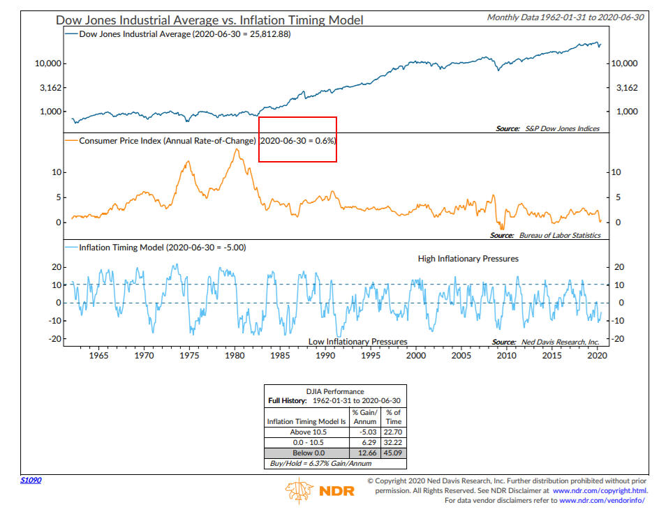
Many economists and other market observers have been mystified in recent years as to how the Fed could be printing so much money, ostensibly out of thin air, and not cause inflation to soar. It just hasn’t happened. And, I can’t tell you when it will. With unprecedented government intervention in the financial markets, we’re now hearing people say “there will never be inflation” and “interest rates will never go up again.” I am leery of joining that crowd. But, currently, and for the better part of the past 20 years, inflation is running pretty low. As the chart below from Ned Davis Research shows, the Consumer Price Index year-over-year change is running at 0.6% through June 30. If that persists through the end of August, that should approximate next January’s cost-of-living-adjustment for Social Security recipients. However, with medical premiums almost always rising, any increase from the COLA will likely be mostly offset by a corresponding rise in Medicare premiums.
Stock Market Seasonality And The U.S. Dollar / Euro
Stocks have been in rally mode since late March, with very little downside the last four months. In the past, we’ve written about the tendency of stocks since 1950 to mostly go up from November to April, and mostly go nowhere from May to October. In the last 10 months, just the opposite has occurred. In the favorable six months, the S&P 500 Index went down -4%, and yet has gained over 13% since April 30. As we’ll cover in more detail either next month or early October, the performance of stocks in the three months leading up to the election has had nearly a 90% success rate in predicting the winner. Up and the incumbent tends to win, down and the incumbent tends to lose.
If long term seasonal tendencies kick in, stocks should struggle in August and September. Below is a S&P 500 Index Seasonality Chart going back to 1950, courtesy of Arthur Hill at www.trendinvestorpro.com.
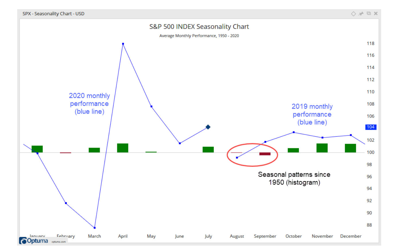
Going back 70 years, August is the 4th worst month of the year, while September is THE worst month of the year. Given excessively bullish sentiment, the odds favor a setback in coming months, but this market has been defying the odds since late March, thanks in great part to the Federal Reserve Board.
What is also taking place as we enter this time period is sentiment behavior and price action in the U.S. Dollar and the Euro. The U.S. Dollar peaked in late March, coincident with stocks bottoming, and has been declining ever since. In contrast, the Euro bottomed with stocks in late March, and has been rallying ever since, with a near vertical move in July (see the chart below, courtesy of www.cqg.com and www.elliottwave.com.)

The rally has been so strong in the Euro that bullish sentiment is now the most lopsided in over 9 years, according to the Elliott Wave Short Term Update. This is shown as the 5-day reading of the DSI (Daily Sentiment Index), the lower clip on the chart. With trends strongly up in the Euro, stocks and gold/silver, we’ll see if sentiment and seasonality matters in the next couple of months.
Why We’re Cautious on Future Returns From Current Levels
If you hadn’t looked at a chart of the S&P 500 since late December, and picked one up over the weekend, one wouldn’t have felt the -34% decline in about 35 days, nor the nearly 48% recovery since then. As a result, most stock market valuation tools are exhibiting similar warnings about future returns as they were in January/February. One of those tools is using the price/earnings ratio of the S&P 500 on 5-year normalized earnings, as a method to predict future 10-year forward returns, as presented by my friends at The Leuthold Group, below.

As shown on the chart, on July 17, the 5-year normalized P/E was 27.0. With data going back to 1940, the correlation coefficient is a very strong -0.82 (go back to your statistics class!). This current reading corresponds to about a 3% compound return for the next 10 years. Other methods we follow are suggesting a range from 0% to 6% on the high end. In other words, with the S&P 500 Index back at 3300, there is no Women’s or Men’s Sale at Nordstrom’s going on in the stock market.
Current Positioning
Going into February of this year, our portfolios were heavily invested, with almost all stock models bullish and our high yield bond model bullish. But, that had been the case since around July of 2019. Ironically, it is also the case now, as in early July, two of our stock models flipped bullish (now four of five), and equity allocations were increased to around 83%, and later in the month, our high yield bond model went back on a BUY for the third time in five months. That is unprecedented, much like most of 2020.
We’ve pointed out several risks in the paragraphs above that are looming, but until prices begin to break down, we’re not likely to see any reductions in our exposure. At present, the first trouble spot for the S&P 500 would be the 3190 level, which is over 3% below current levels. Meanwhile, Party Like It’s 1999. Until it’s not.
Material Of A Less Serious Nature
A young woman decided to give horseback riding a try, even though she had no past experience. She climbed up on the horse with no assistance, and it immediately broke into a gallop. She began slipping from the saddle and tried to grab the horse’s mane. Not being able to get a good grip, the woman threw her arms around the horse’s neck. But, she continued to slip off the horse.
The horse refused to slow down, and the woman, afraid of falling under the pounding hoofs, attempted to throw herself off the horse to safety. Instead, her foot got tangled in the stirrup, leaving the woman hanging upside down with her head bouncing on the ground.
She was only moments away from unconsciousness when to her great fortune, Bill, the Wal-Mart greeter, saw her predicament and unplugged the horse.

Believe it or not, they’re playing baseball, basketball and hockey in empty stadiums and arenas. It’s pretty weird. When I’m yelling and it’s louder than the fake crowd noise, well, something’s wrong with this picture! Some things never change, though. My Angels are 3-7 and look awful. There is always hope, though. My Dallas Stars begin their quest today for the Stanley Cup. I truly don’t know how I will feel if they actually win the Cup, and I can’t even go to a game. Yeech.
Meanwhile, please stay safe and healthy, both mentally and physically. We know the COVID-virus is temporary, but the unknown is how long we’ll all have to continue with significant changes to our routines. We cannot control the virus, but we can control our attitude.
Sincerely,

Bob Kargenian, CMT
President
TABR Capital Management, LLC (“TABR”) is an SEC registered investment advisor with its principal place of business in the state of California. TABR and its representatives are in compliance with the current notice filing and registration requirements imposed upon registered investment advisors by those states in which TABR maintains clients. TABR may only transact business in those states in which it is notice filed, or qualifies for an exemption or exclusion from notice filing requirements.
This newsletter is limited to the dissemination of general information pertaining to our investment advisory/management services. Any subsequent, direct communication by TABR with a prospective client shall be conducted by a representative that is either registered or qualifies for an exemption or exclusion from registration in the state where the prospective client resides. For information pertaining to the registration status of TABR, please contact TABR or refer to the Investment Advisor Disclosure web site (www.adviserinfo.sec.gov).
The TABR Model Portfolios are allocated in a range of investments according to TABR’s proprietary investment strategies. TABR’s proprietary investment strategies are allocated amongst individual stocks, bonds, mutual funds, ETFs and other instruments with a view towards income and/or capital appreciation depending on the specific allocation employed by each Model Portfolio. TABR tracks the performance of each Model Portfolio in an actual account that is charged TABR’s investment management fees in the exact manner as would an actual client account. Therefore the performance shown is net of TABR’s investment management fees, and also reflect the deduction of transaction and custodial charges, if any.
Comparison of the TABR Model Portfolios to the Vanguard Total Stock Index Fund, the Vanguard Total International Stock Fund and the Vanguard Total Bond Index Fund is for illustrative purposes only and the volatility of the indices used for comparison may be materially different from the volatility of the TABR Model Portfolios due to varying degrees of diversification and/or other factors.
Past performance of the TABR Model Portfolios may not be indicative of future results and the performance of a specific individual client account may vary substantially from the composite results above in part because client accounts may be allocated among several portfolios. Different types of investments involve varying degrees of risk, and there can be no assurance that any specific investment will be profitable.
The TABR Dividend Strategy presented herein represents back-tested performance results. TABR did not offer the Dividend Strategy as an investment strategy for actual client accounts until September/October 2014. Back-tested performance results are provided solely for informational purposes and are not to be considered investment advice. These figures are hypothetical, prepared with the benefit of hindsight, and have inherent limitations as to their use and relevance. For example, they ignore certain factors such as trade timing, security liquidity, and the fact that economic and market conditions in the future may differ significantly from those in the past. Back-tested performance results reflect prices that are fully adjusted for dividends and other such distributions. The strategy may involve above average portfolio turnover which could negatively impact upon the net after-tax gain experienced by an individual client. Past performance is no indication or guarantee of future results and there can be no assurance the strategy will achieve results similar to those depicted herein.
Inverse ETFs
An investment in an Inverse ETF involves risk, including loss of investment. Inverse ETFs or “short funds” track an index or benchmark and seek to deliver returns that are the opposite of the returns of the index or benchmark. If an index goes up, then the inverse ETF goes down, and vice versa. Inverse ETFs are a means to profit from and hedge exposure to a downward moving market.
Inverse ETF shareholders are subject to the risks stemming from an upward market, as inverse ETFs are designed to benefit from a downward market. Most inverse ETFs reset daily and are designed to achieve their stated objectives on a daily basis. The performance over longer periods of time, including weeks or months, can differ significantly from the underlying benchmark or index. Therefore, inverse ETFs may pose a risk of loss for buy-and-hold investors with intermediate or long-term horizons and significant losses are possible even if the long-term performance of an index or benchmark shows a loss or gain. Inverse ETFs may be less tax-efficient than traditional ETFs because daily resets can cause the inverse ETF to realize significant short-term capital gains that may not be offset by a loss.
For additional information about TABR, including fees and services, send for our disclosure statement as set forth on Form ADV from us using the contact information herein. Please read the disclosure statement carefully before you invest or send money.
A list of all recommendations made by TABR within the immediately preceding one year is available upon request at no charge. The sample client experiences described herein are included for illustrative purposes and there can be no assurance that TABR will be able to achieve similar results in comparable situations. No portion of this writing is to be interpreted as a testimonial or endorsement of TABR’s investment advisory services and it is not known whether the clients referenced approve of TABR or its services.