Total Return vs Yield/Cash Flow
I just want to live off my dividends. I’ve heard that comment, or something similar, from a number of clients over the years. Or, from real estate investors—it’s all about cash flow. There are flaws in both of these dictums, and we’ll tackle this topic this month in depth.
This was prompted from an email I received, declaring “At a 30-year low, is AT & T a BUY?” Hence, Total Return vs Yield. Due to the in-depth nature of this piece, we’ll defer the other topics we intended to touch on until our next update. Steve Medland will be doing next month’s piece, and then I’ll be back. Read on.
Yields And Cash Flow Are Only Half The Story
First, I had to confirm that the headline in the email was in fact, true. Was AT & T stock really at a 30-year low? Take a look at the chart below, which I gleaned from Yahoo Finance.
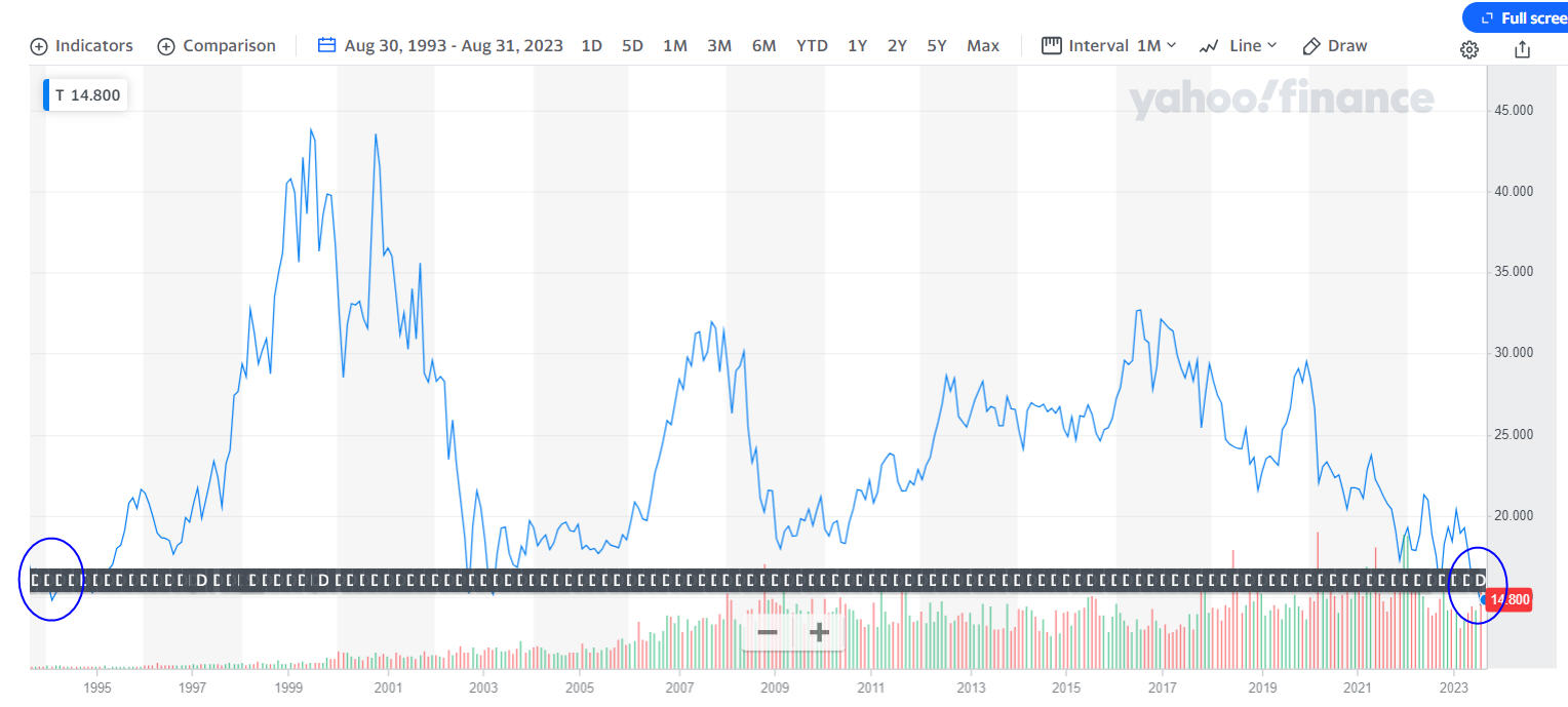
I went back to August 1993 to create this chart. Please forgive the weird line across the bottom which obscures some of the price action. That seems to be a tool to allow one to view dividends. In any case, on a price alone basis, yes, I did find the stock is trading at a 30-year-low. In August 1993, the stock was 17.18, and today it sits at 14.79. Does this mean shareholders who purchased the stock in 1993 and never sold have lost money for 30 years? No. The price is only half the story. The other portion is dividends, and most charts you see do not present dividend-adjusted data. In fact, dividend-adjusted data is hard to find, but Yahoo Finance does provide it, and we’ve been using a software program for professional traders called FastTrack which we consider to be the best source. We decided to do some research and see just how AT & T has done, dividend-adjusted, during the past 30 years, broken down into 10-year periods.
| Date | Nominal Price | Dividend-Adjusted Price | Compound Return AT & T | Compound Return S&P 500 | |
| AT & T Stock | August 30, 1993 | 17.18 | 2.70 | 5.7% for 30 years | 9.98% for 30 years |
| AT & T Stock | August 29, 2003 | 16.96 | 4.00 | 6.5% for 20 years | 9.93% for 20 years |
| AT & T Stock | August 30, 2013 | 25.55 | 12.07 | 1.6% for 10 years | 12.44% for 10 years |
| AT & T Stock | August 31, 2023 | 14.11 | 14.11 |
When you examine the above data, one has much more context. As far as we can derive, near the end of 1993, AT & T was paying a dividend of 0.1885 cents per share, per quarter, for an approximate yield at that time of 4.64%. As the table illustrates, the stock compounded for the 30 years at 5.7%, meaning virtually all of the gain in the stock over this period has come from dividends, not from growth. Furthermore, the stock has lagged the S&P 500 Index during this period by over 400 basis points per year (4%). That’s a bad combination. As far as we can tell from the data, the S&P 500 Index at the end of 1993 was yielding about 2.76%. Its yield was nearly 200 basis points less than AT & T, yet the index has beaten the performance of AT & T stock by over 400 basis points, annually, for 30 years.
Do you see what I’m getting at here? A higher yield did not result in a superior investment. And, we find this over and over again, in stocks and in real estate. The disparity in performance between the stock and the S&P 500 Index has become awful during the past 10 years, thanks to the heavy debt load of AT & T and poor management decisions. Today, the current yield on AT & T stock is 7.53% compared to 1.39% on the S&P 500. Will the next 10 years be any better? I have no idea, but the outcome here illustrates another salient point. It is not really a prudent path to invest in several or even 10 or 20 individual stocks that pay dividends. In February 2022, AT & T cut their dividend in half, after spinning off Warner Brothers. They needed to conserve cash. You may remember that during the Covid outbreak, Disneyland was shut down indefinitely. As a result, Disney eliminated their dividend, and they’ve yet to restore it. For a real estate investor, this would be like a renter who no longer pays rent. How do you make those numbers work then?
So, yes, cash flow is important, but it’s only part of the equation. A dividend yield focused approach, especially one which holds the highest-yielding issues, has a number of flaws and has actually more risk than strategies which emphasize moderate or low yields (and even no yield). We’ve witnessed this first-hand in our research in this area, and lived through it during the Covid year, and not well, I might add.
For those inclined to allocate to this area, I’ve found the same relationship within various dividend-focused funds. Funds which focus on dividend growth rather than dividend yield have had the better total returns. And, if my point didn’t come across from above, it’s a much better idea to own a mutual fund or ETF with a dividend strategy focus than to attempt to pick individual stocks. Professional managers make mistakes too, but they are much less impactful in a fund which may own hundreds of companies, instead of just a select few. Take a look at the data below I’ve compiled on five popular funds (all ETFs) in the dividend focus area.
| Fund | SEC Yield | YTD thru 8-30 | 5 Year Returns | 10 Year Returns | 15 Year Returns |
| Vanguard Div Appreciation(VIG) | 1.78% | 8.91% | 10.51% | 11.51% | 10.28% |
| Dividend Aristocrats(NOBL) | 1.88% | 6.39% | 9.70% | n/a | n/a |
| S&P Dividend ETF(SDY) | 2.58% | -0.72% | 7.50% | 10.26% | 10.36% |
| Vanguard High DivYld (VYM) | 3.08% | 1.25% | 7.68% | 10.06% | 9.49% |
| High Div Low Volatility (SPHD) | 4.90% | -2.89% | 4.17% | 8.62% | n/a |
The three funds with the lowest yields have the highest long-term compound returns. The common theme among the three funds is that they concentrate on dividend growth rather than dividend yield. The Vanguard Dividend Appreciation Fund imposes a screen which requires at least 10 consecutive years of dividend growth. The S&P Dividend Fund (SDY) goes further, requiring 20 years of growth, while the Dividend Aristocrats Fund (NOBL) requires at least 25 years.
Another thing to keep in mind is that markets have changed over time. In the 1960s, 1970s and 1980s, stock dividend yields were much higher. For instance, from 1973 to 1983, the average dividend yield for the S&P 500 was 4.73%. That’s the average for 500 stocks. This yield dropped below 3% in 1992, and since then, in 31 years has been back above 3% for only one year, that of 2008.
It may have been possible to live off dividend yields of 4% and 5% in those time periods, but they are long gone for the average stock. Hence, total return. If you think about it, the higher the dividend yield a stock pays, the greater portion of earnings that must be devoted to paying the dividend. This can stunt growth, and eventually, when hard times come, many companies that are paying high dividend yields have to cut them, and then the stock tanks, so investors get a double whammy—lower yields and typically, capital losses.
This pattern of higher yielding stocks being more risky is not just limited to individual stocks. It plays itself out in a similar manner with real estate, and especially with real estate investment trusts, both private (non-traded REITS) and publicly traded.
Non-Traded Private And Public REITS. Fake Yields?
I started in this business in 1982, getting my securities license in June 1982 with the old E.F. Hutton & Company. So, I’m in for 41 years and counting. Even today, Wall Street pushes product, and I hope it’s not as bad as it was in the 80s and 90s, but I had a conversation a week ago with a friend that I met while doing my running each morning in Yorba Linda which reminded me that a lot has not changed. Of all the products that Wall Street sells, I’d have to say that private and public non-traded real estate investment trusts have to be at or near the top of the list as being the worst crap ever. You might argue that I’m cherry picking the following example, and I wish you were right. Unfortunately, there are many more just like the one I’m going to dive into. All in the name of chasing yield, or perhaps I should say “selling yield,” because I really don’t think our clients were chasing these investments. Rather, they were sold these investments by brokers/advisors who not only didn’t do their homework, but were paid handsomely by their firms to sell the partnerships. In this area, poor outcomes are the rule, not the exception. Total Return versus Yield/Cash Flow. Read on.
One of our dear clients was sold several real estate partnerships back in 2015 from a sponsor named American Finance Trust. The Realty Finance Trust they invested in owned 72 debt investments totaling a par value of over $885 million, and was paying monthly dividends which annualized at 8.25%. The partnership was originally priced at $25.00 per share. Sounds great, right, especially when you consider that at that time, the yield on the 10-year Treasury Note was below 1.75% in January 2015.
Keep in mind that partnerships of this nature are not liquid (at least not in the beginning). That’s at least clearly communicated. You are locking your money up usually for many years, typically 7 to 10 years, with the promise of high monthly or quarterly cash flow (yield), and an expectation that at the end, the investments will be sold, and you’ll get all your money back, and then some. It’s not guaranteed, but it sure is marketed as quite enticing. After all, who wouldn’t want an 8% yield on your money in a 2% world? You’ll notice I didn’t say “an 8% return on your money.” It gets better.
In January 2017, barely two years into its existence, the NAV (net asset value) of the Fund had declined to 20.05, a -20% decline. In February 2017, the partnership changed its name to Benefit Street Partners. I’m not certain who created that name, but it’s pretty clear it was not the shareholders who Benefited. By December 2018, the NAV was down to 18.75. Then, in February 2019, the partnership was sold to Franklin Templeton Investments. Franklin Templeton is actually a pretty good investment management firm, lending some much needed credibility to the deal, but they haven’t quite been able to turn the ship around, given all the previous damage.
According to statements we have, the NAV had declined to 17.88 in December 2020. By October 2021, a partial conversion was done, and shares began to trade on the NYSE under the ticker symbol FBRT. At that time, the Trust merged with Capstead Mortgage. You can see the chart below, and its subsequent trading to the present. The chart is from Morningstar, as well as the tables below. See www.morningstar.com.
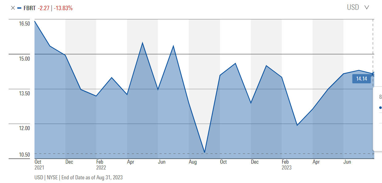
On September 30 of last year, the stock traded as low as 10.34, over -39% below the first liquid trades which took place in October 2021 at 17.10, and some -58% below the original offering price of 25.00. Buy, hey, what about those dividends?
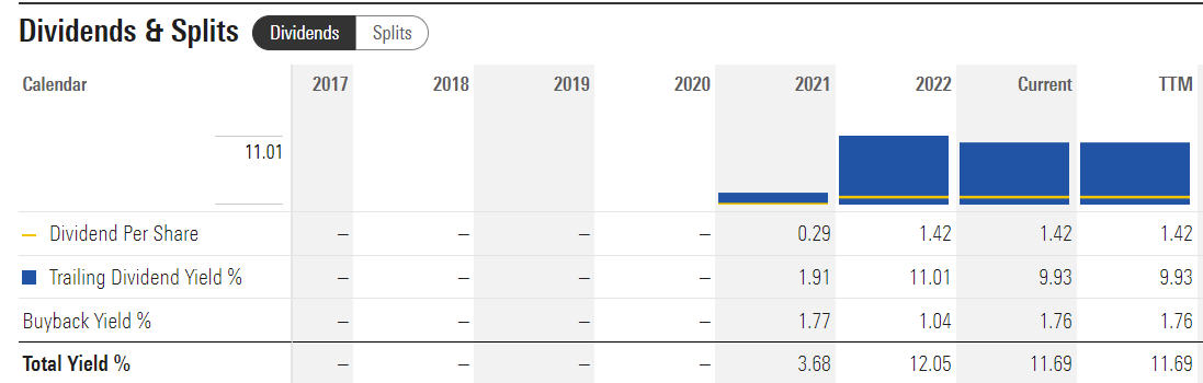
As the table above illustrates (also from Morningstar), in the limited history since Franklin Templeton took over, the annual dividend has remained steady at $1.42 per share, or 0.355 per quarter, giving the fund a yield of 9.93%. As is the point of this whole analysis, the dividend payouts aren’t the same as the total return on your investment. From October 19, 2021 to September 1, 2023, the period when FBRT shares have been trading publicly, the stock price has declined from 17.10 to 14.30, a decline of -16.3%.
Per the data from Yahoo Finance, the dividend-adjusted price of the fund during the same period has gone from 14.26 to 14.30. That’s a total return of 0.28% for nearly two years. What’s been happening? See the operating performance below.
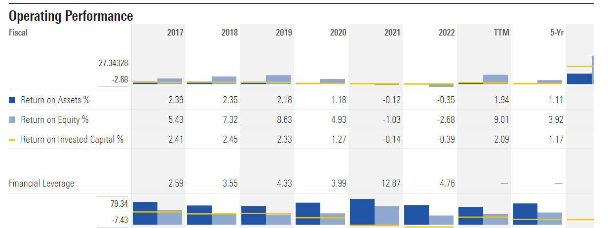
As noted above, the Trust’s 5-year Return On Assets has been a paltry 1.11%, yet they’ve been paying out consistently a yield of about 9%. That’s a long-term recipe for disaster, which is in fact what has happened to the stock price, or NAV, over time. Remember, the original offering price was $25, and today the stock trades at 14.30, a decline of -42%.
Because of the changes in management and the non-public pricing of the data from 2015 until late 2021, I can’t really compute a dividend-adjusted total return of the Trust from inception, but my educated guess in looking at the data would be a compound return in the range of 1% on the low side, and 3% on the high side. Mind you, this has all been accomplished with leverage, which currently is running at 2.35 times, and likely has been much higher in the past.
Do you know the reason why an investment of this sort could offer an 8% yield in what at the time was a 2% world? Leverage. That’s the only way. And leverage can bite you in the ass when interest rates rise, and that’s certainly part of what’s happened. There’s another issue this reminds me of, which many real estate investors fail to consider when they are looking at their rental properties.
Unless one is an all-cash real estate investor, you’re employing leverage. It’s just a matter of how much. Example–you purchase a $600,000 property, and put $150,000 down, and get a mortgage for $450,000. You’re now leveraged 4 to 1. That leverage can either kill your investment, or enhance the returns significantly, but don’t compare your returns to unleveraged investments such as the stock market, which are 1 to 1, unless one goes on margin, which we’d not recommend. Whether you’re comfortable with real estate or not, one is taking on more risk with leverage than with traditional stock market investments. And though investors didn’t borrow to invest in FBRT or into the original American Finance Trust, they are by default investing in a leveraged investment. I can tell you from experience, the vast majority of investors who are sold this crap don’t realize this, or they are blind to it.
Can you make money from a fund such as FBRT? If your timing’s great, yes. Look back at the fall of 2022 and the chart above. Had you purchased at 12, which wasn’t even the exact low, you’d now be sitting on a 19% gain with a yield of over 9%. Not bad. You only had to wait over 8 years for that opportunity. If I haven’t convinced you yet that Total Return is more important than Yield/Cash Flow, well, honestly, nothing will.
Rental Property Analysis
To wrap up this analysis of looking at Total Return versus Yield/Cash Flow, I thought we’d present two cases of actual rental properties that a client has, and how the analysis of the financials should be viewed, using data from Schedule E on the federal tax return. We’re simply going to call these Property A and Property B.
| Data For 2021 Tax Year | Property A | Property B |
| Rents Received | $33,542 | $26,400 |
| Insurance | 0 | $404 |
| Management Fees | $12,650 | 0 |
| Taxes | $2,396 | $1,800 |
| Utilities/Repairs | $0 | $2,190 |
| Miscellaneous Expenses | $14,866 | 0 |
| Net Income | $3,630 | $22,006 |
Let me state some obvious disclaimers here. First, this only represents one year of data. Just like a mutual fund or a stock, one needs to look at things over many years. Second, I purposely have not shown the depreciation expense. That’s a tax figure which serves to create a write-off but which also serves to lower the cost basis of the property. It doesn’t have anything to do with real, net income. And lastly, one needs to know the purchase price of the property, and for some further perspective, their estimated current values, so one can compute the cap rate.
Property A didn’t have a great year in 2021. It was purchased for $427,000. The net yield on original capital was less than 1%. But, from 2016 to 2019, net income each year was $11,600, $14,100, $14,000 and $12,800. That at least gets you to 2.7% to 3.30%. The property was sold in 2021 for $585,000 (before closing costs), so we know there was a real capital gain, but the taxable capital gain would be greater because every year you’re taking depreciation, you are lowering your cost basis. Since our client paid cash for these, if we use $30,000 for closing costs (perhaps a bit low), I’d suggest there was a real capital gain of about $128,000, or about 29% on original capital.
Given the time they held the property, plus the variability in net rental income, this was not a disastrous investment, but also probably not what our client envisioned. That’s in contrast to Property B. This property was purchased in 2014 for $277,000, and today is valued at $700,000. Look at the net rental income since the first full year of 2015, below.
2015 $8,947
2016 $8,410
2017 $8,788
2018 $9,612
2019 $12,031
2020 $11,560
2021 $22,006
2022 $19,658
Net yields were just above 3% in the first three years, jumped to over 4% in 2019, and approached 8% in 2021. Throw in an unrealized gain of over $400,000 on the value of the property in over 8 years, and you have yourself a home run. Property B is a great example of solid yield and solid total return. It’s what any investor would aspire to, but very few attain—or if they do, they are typically offset by a clunker. For individual investors, purchasing individual properties is fraught with the inability to diversify holdings, offset by the advantage of being able to control the leverage and management.
This is where the structure of a real estate fund has many advantages, but evaluating the quality of the management of a fund or trust is paramount, and most individuals are not equipped with this knowledge, and frankly, most advisors aren’t either. Many advisors are simply enticed by the high commissions these products have typically paid, which aren’t in the best interests of the client.
In sum, whatever your preference—stocks, real estate, bonds or all three, make sure you focus on total return, not yield. They are not the same, and an undue emphasis on the latter can be harmful to your investing health.
Portfolio Allocations
After over two months with no changes in any of our tactical models, we had two changes last week. One of our intermediate stock market models went negative early in the week, followed by a BUY from a shorter term model we use, which meant that our tactical stock exposure went from 80% to 60% and back to 80% in a span of four days. That’s just the nature of trading.
In fixed income, our high yield bond fund risk model remains positive, now going on for nearly 5 months, with prices very near their highs, and we also remain fully invested in the PIMCO Income Fund. We had warned of seasonal weakness last month, and thus far, markets have cooperated, with large cap indexes down about -1.7% in August (S&P 500 and ND), but with greater losses in small cap stocks and Europe (IJR and IEV).
Dead ahead is statistically, the worst month of the year for stocks in September. Then, the cycles turn more favorable in late October into year-end. We’ll see if stocks can buck the seasonal trend in coming weeks.
Material Of A Less Serious Nature
Joey the altar boy entered the confession booth and said, “Bless me Father, for I have sinned. I have been with a loose girl.”
The preist asks, “Is that you, little Joey Pagano?”
“Yes, Father, it is.”
“And who was the girl you were with?”
“I can’t tell you, Father. I don’t want to ruin her reputation.”
“Well, Joey, I’m sure to find out her name sooner or later so you may as well tell me now. Was it Tina Minetti?” “I cannot say.”
“Was it Teresa Mazzarelli?” “I’ll never tell.”
“Was it Nina Capelli?” “I’m sorry, but I cannot name her.”
Was it Cathy Piriano?” “My lips are sealed.”
“Was it Rosa DiAngelo, then?” “Please, Father! I cannot tell you.”
The priest sighs in frustration. “You’re very tight lipped, and I admire that. But you’ve sinned and must atone. You cannot be an altar boy for four months. Now go and behave yourself.”
Joey walks back to his pew, and his friend Franco slides over and whispers, “What’d you get?”
“Four months vacation and five good leads. . . .”
September means school has resumed in almost every area, college football is starting, the Angels are missing the playoffs again (that’s not new!), my Giants are trying to sneak into a wildcard spot and I can’t wait for my 49ers to begin what hopefully will be a Super Bowl run. And in two weeks, for the first time since 1994, we will have an empty house as we ship off daughter Caroline to begin college at Cal Poly San Luis Obispo. It’s definitely going to be different.
What’s not different, though, is our continued appreciation for your trust and confidence in all of us at TABR. Thank you.
Sincerely,

Bob Kargenian, CMT
President
TABR Capital Management, LLC (“TABR”) is an SEC registered investment advisor with its principal place of business in the state of California. TABR and its representatives are in compliance with the current notice filing and registration requirements imposed upon registered investment advisors by those states in which TABR maintains clients. TABR may only transact business in those states in which it is notice filed, or qualifies for an exemption or exclusion from notice filing requirements.
This newsletter is limited to the dissemination of general information pertaining to our investment advisory/management services. Any subsequent, direct communication by TABR with a prospective client shall be conducted by a representative that is either registered or qualifies for an exemption or exclusion from registration in the state where the prospective client resides. For information pertaining to the registration status of TABR, please contact TABR or refer to the Investment Advisor Disclosure web site (www.adviserinfo.sec.gov).
The TABR Model Portfolios are allocated in a range of investments according to TABR’s proprietary investment strategies. TABR’s proprietary investment strategies are allocated amongst individual stocks, bonds, mutual funds, ETFs and other instruments with a view towards income and/or capital appreciation depending on the specific allocation employed by each Model Portfolio. TABR tracks the performance of each Model Portfolio in an actual account that is charged TABR’s investment management fees in the exact manner as would an actual client account. Therefore the performance shown is net of TABR’s investment management fees, and also reflect the deduction of transaction and custodial charges, if any.
Comparison of the TABR Model Portfolios to the Vanguard Total Stock Index Fund, the Vanguard Total International Stock Fund, the Vanguard Total Bond Index Fund and the S&P 500 Index is for illustrative purposes only and the volatility of the indices used for comparison may be materially different from the volatility of the TABR Model Portfolios due to varying degrees of diversification and/or other factors.
Past performance of the TABR Model Portfolios may not be indicative of future results and the performance of a specific individual client account may vary substantially from the composite results above in part because client accounts may be allocated among several portfolios. Different types of investments involve varying degrees of risk, and there can be no assurance that any specific investment will be profitable
For additional information about TABR, including fees and services, send for our disclosure statement as set forth on Form ADV from us using the contact information herein. Please read the disclosure statement carefully before you invest or send money.
A list of all recommendations made by TABR within the immediately preceding one year is available upon request at no charge. The sample client experiences described herein are included for illustrative purposes and there can be no assurance that TABR will be able to achieve similar results in comparable situations. No portion of this writing is to be interpreted as a testimonial or endorsement of TABR’s investment advisory services and it is not known whether the clients referenced approve of TABR or its services.